


Reviewing my UX work? I'd love your comments on my full case study.
Project Snapshot
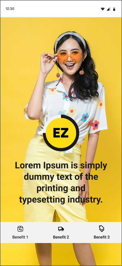
Developed 'Easy (EZ)', a mobile shopping app tailored for English-speaking foreign residents in Japan. The app addresses common challenges such as language barriers, product & vendor tust issues, difficult product description pages, and complex navigation found in local e-commerce platforms.

My Role

Role: UX Designer (research, prototyping, UI)
Team: Solo project
Tools: Figma, FigJam, Google Forms, Excel (Gantt Chart)
The Problem

English-speaking foreign residents in Japan absolutely struggle to navigate and trust local e-commerce platforms due to language and cultural barriers that create unclear product information sections, and unnecessary complicated checkout processes. This leads to frustration, cart abandonment, and missed opportunities for both users and sellers.
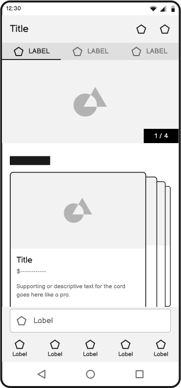
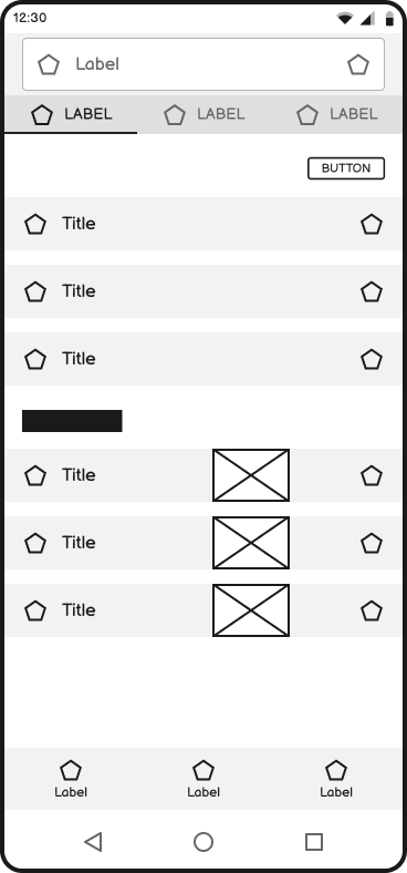
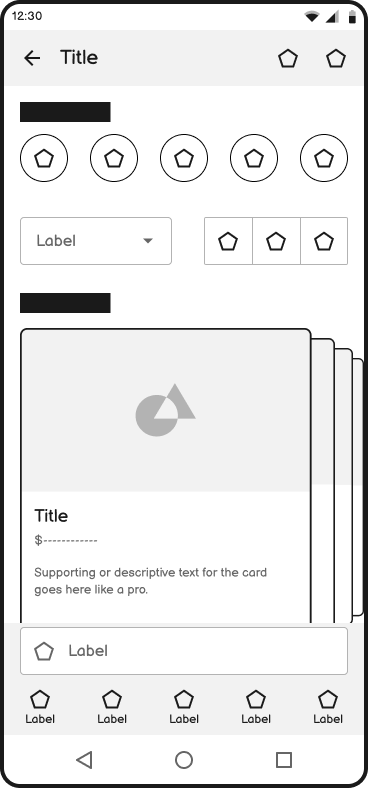
Wireframes
-
![loading screen]()
Loading Screen
-
![login & signup Screen]()
Login Screen
-
![home screen]()
Home Screen
-
![search screen]()
Search Screen / Modal
-
![listing screen]()
Listing Screen
-
![product description screen]()
Product Description Screen
-
![added to shopping cart modal]()
Confirmation Modal
-
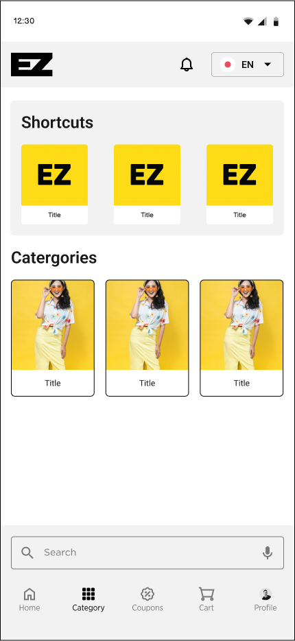
![category screen]()
Category Screen
-
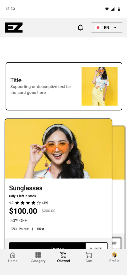
![okawari]()
Okawari (refill)
-
![product refill description screen]()
product refill description screen
-
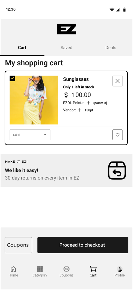
![shopping cart screen]()
Shopping Cart Screen
-
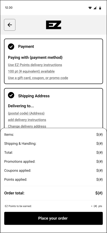
![checkout screen]()
Check Out Screen
-
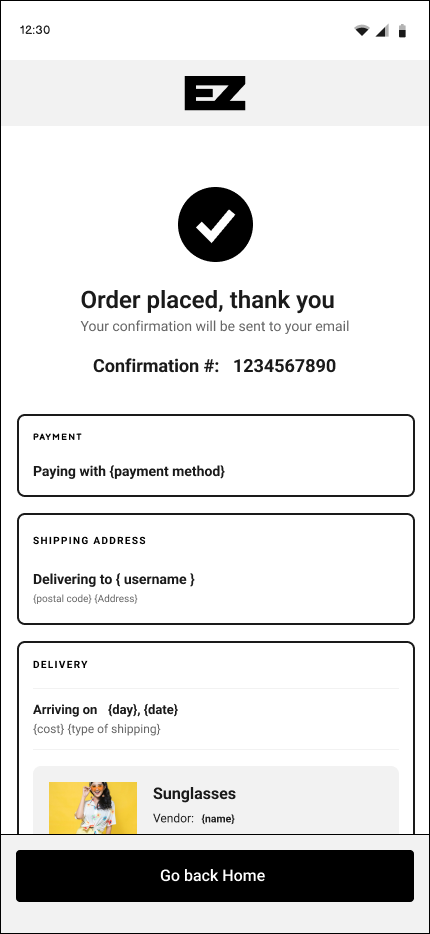
![confirmarion screen]()
Confirmation Screen


The Solution
To address the challenges English-speaking foreign residents face when using Japanese e-commerce platforms, the Easy (EZ) mobile app delivers an intuitive, English-friendly shopping experience. It features clear navigation, detailed product descriptions, and reliable vendor and customer reviews. Most importantly, the app continuously educates users on benefits and trust signals throughout the journey—creating a seamless, transparent experience tailored to this underserved demographic.

Low Fidelity
-
![loading screen]()
Loading Screen
-
![login & signup Screen]()
Login Screen
-
![home screen]()
Home Screen
-
![search screen]()
Search Screen / Modal
-
![listing screen]()
Listing Screen
-
![product description screen]()
Product Description Screen
-
![added to shopping cart modal]()
Added to Cart Modal
-
![category screen]()
Category Screen
-
![okawari]()
Okawari (refill)
-
![Okawari Description Screen]()
product refill description screen
-
![shopping cart screen]()
Shopping Cart Screen
-
![checkout screen]()
Check Out Screen
-
![confirmation screen]()
Confirmation Screen


Usability Test Results

The usability study with five participants (ages 30–50) revealed key areas for improvement in the EZ app’s design. Users struggled with unclear terminology—particularly the term “Okawari”—and expressed a strong need for an “Easy Japanese” option.
Navigation elements like the fixed bottom bar were well received, but swipeable categories and lists caused confusion, and important features like the coupon button, favorite/save, and vendor verification were often missed. Visually, users found the interface too bright and requested a dark mode, while some text, such as on the loading screen, disappeared too quickly.
The study also showed a desire for more intelligent shopping features, including automatic discount application, visible savings, shipping info, filtering by brand or origin, and similar product suggestions. These results highlighted the need for clearer language, more intuitive navigation, improved visibility of key features, and enhanced personalization to better serve foreign users in Japan.
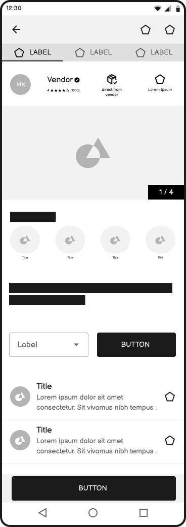
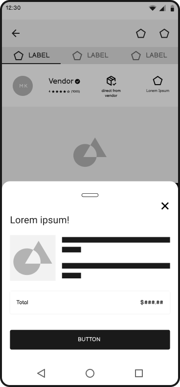
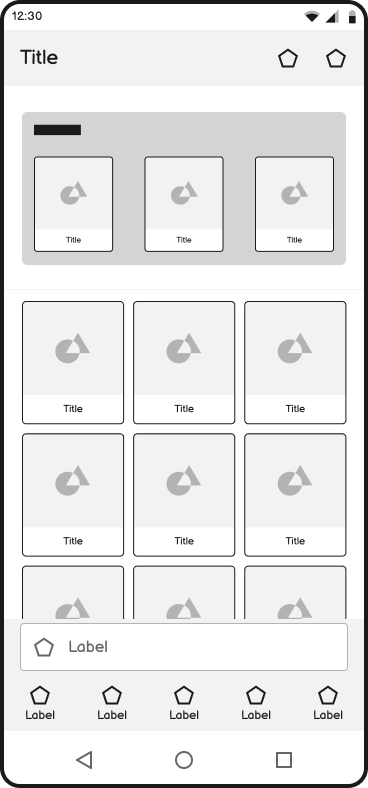
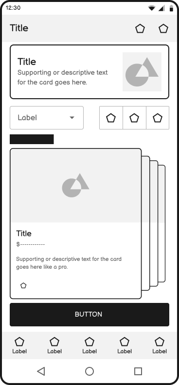
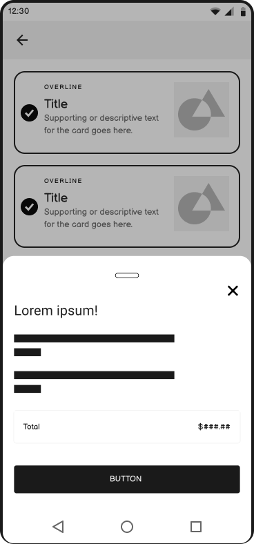
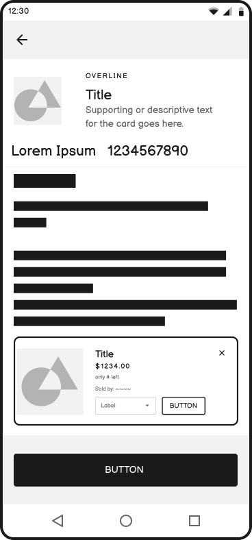
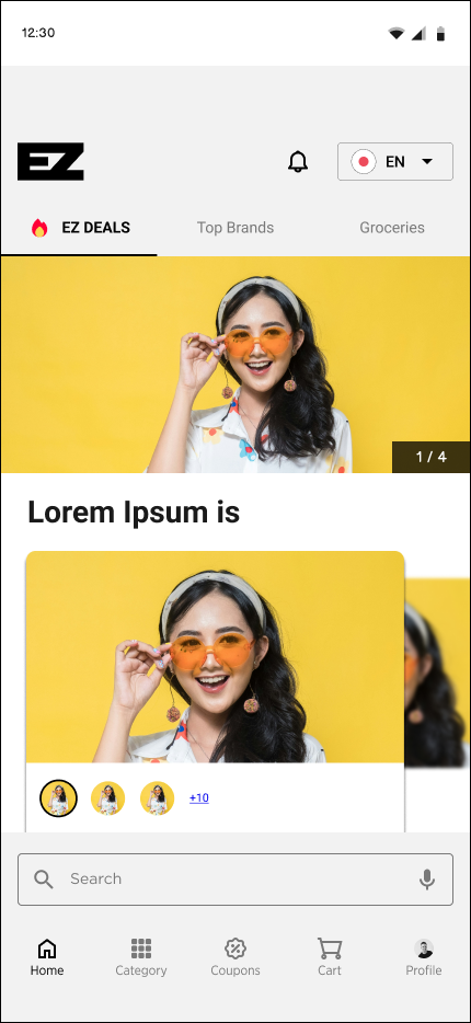
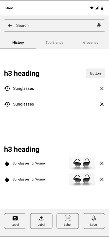
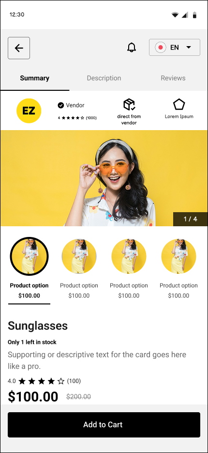
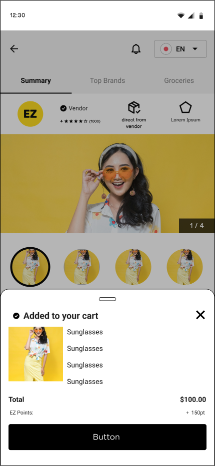
High Fidelity Prototype
What I learned
Six more are located in the full case study
General questions get general answers that lead to more questions, kind of like a dog (Shiba Inu) chasing its tail (as you will see below in the “Notes & Self-Reflection” section). The word Question comes from the Quest. What’s your quest? Be specific or you will get nowhere.
Localization elements like “Okawari” work better when presented with context or explanations, making them more effective in the long term, though difficult to implement short-term. I thought it was a good idea but after I realized most foreigners have elementary level Japanese… I’ll stick to their native language.
Side note - this reminds of when Japanese companies use Engrish on their t-shirts and signages… always funny, never makes sense.
Got a minute? Before you connect with me on LinkedIn. Check out my case study and leave your thoughts!

Do Me a Favour!
“If you can, take a quick second to connect with me on LinkedIn —it would mean the world to me! And if you have any feedback, feel free to contact me using the link below.”
