

Reviewing my UX work? I'd love your comments on my full case study.
Project Snapshot
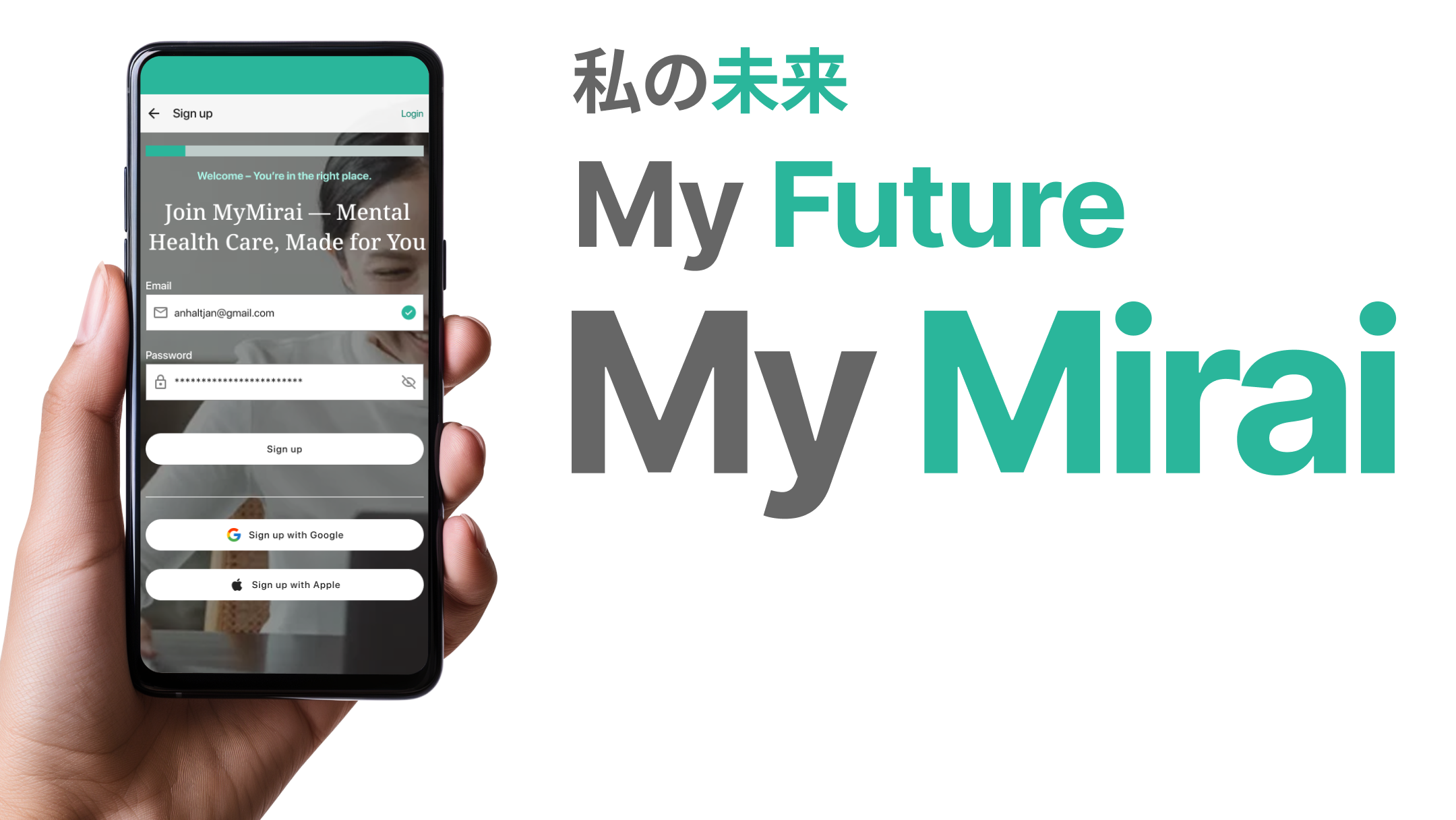
MyMirai is a UX design project for an online mental health platform built for English speakers living in Japan. It addresses the core problems these users face: language barriers, cultural stigma, difficulty navigating Japan’s healthcare system, and lack of accessible, trustworthy mental health support.
MyMirai offers therapy, psychiatric care, and scheduling—all in English—with features like insurance integration, government I.D. verification, and personalized provider matching to make mental health care easier, safer, and more approachable for non-native residents.

My Role

Role: UX Designer (research, prototyping, UI)
Team: Solo project
Tools: Figma, FigJam, Google (Docs, Sheets, Forms)
Conducted user research through interviews, surveys, and empathy mapping
Defined key user needs and created detailed personas
Performed competitor analysis and SWOT evaluation to identify market gaps
Designed the core user journey and prioritized essential platform features
Planned and structured onboarding flows and content strategy
Developed wireframes and layout concepts focused on clarity, trust, and ease of use
Aligned all design decisions with emotional, cultural, and logistical needs of the target audience
The Problem
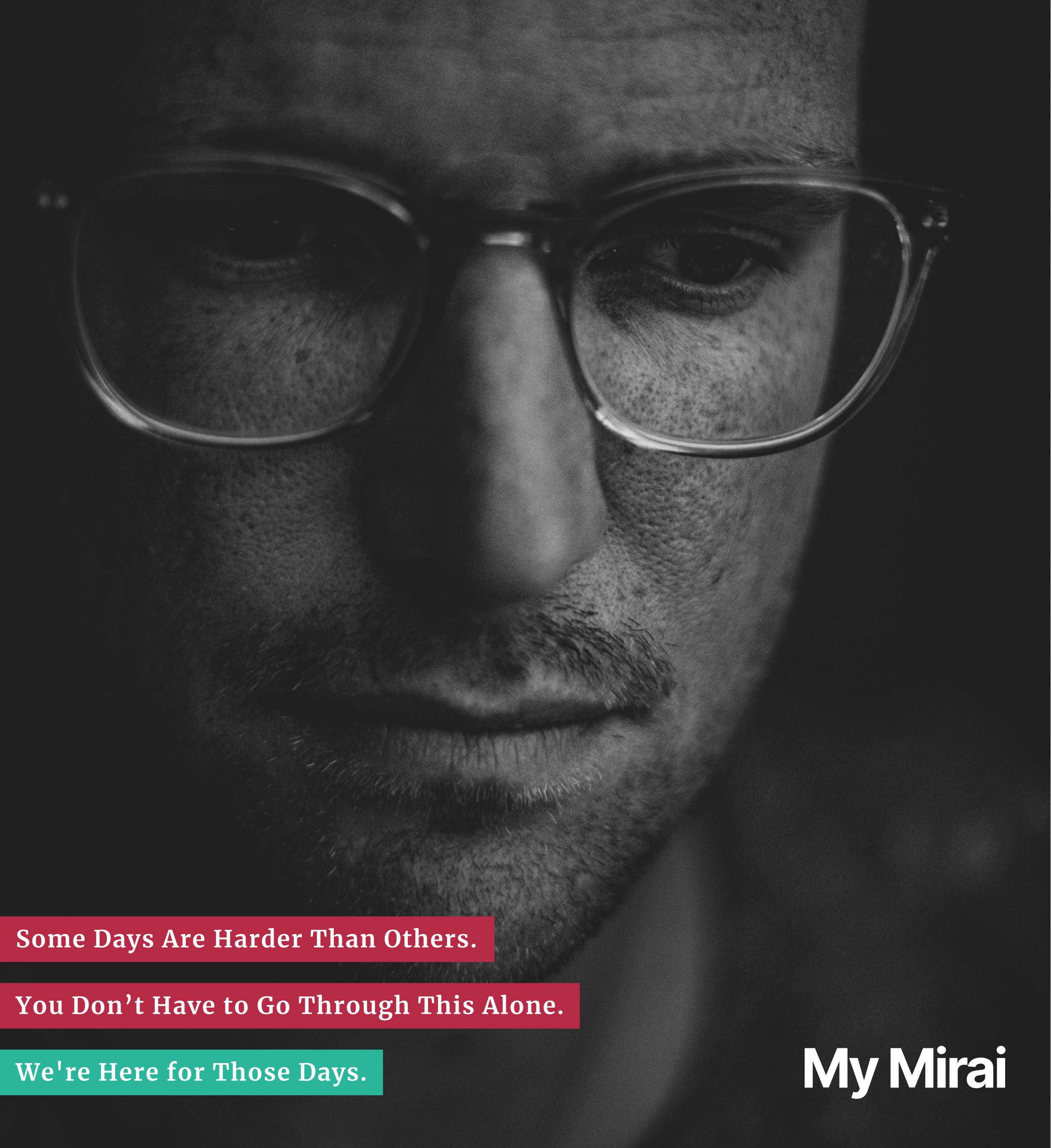
English-speaking residents in Japan often face significant challenges when seeking mental health support—including language barriers, unfamiliar healthcare processes, limited access to English-speaking professionals, and cultural stigma around therapy. These issues create friction, confusion, and often lead to people giving up on care altogether. There is a clear need for a mental health platform that not only offers services in English but is also designed with cultural sensitivity, accessibility, and system navigation in mind.
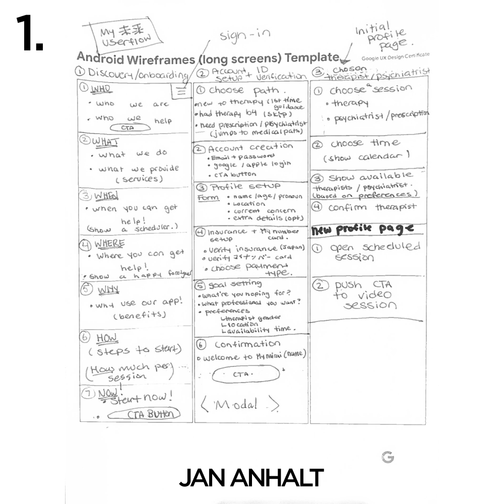
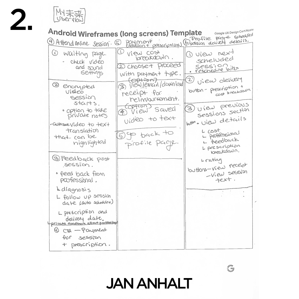
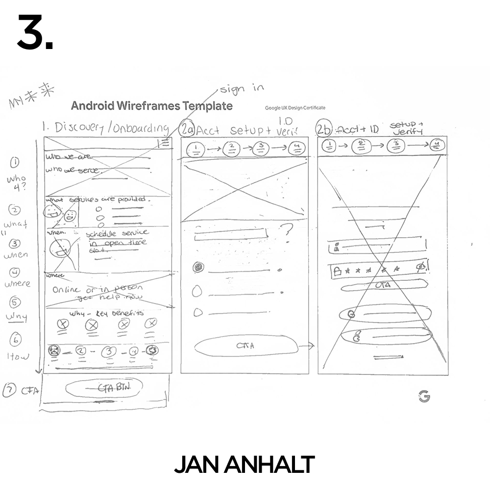
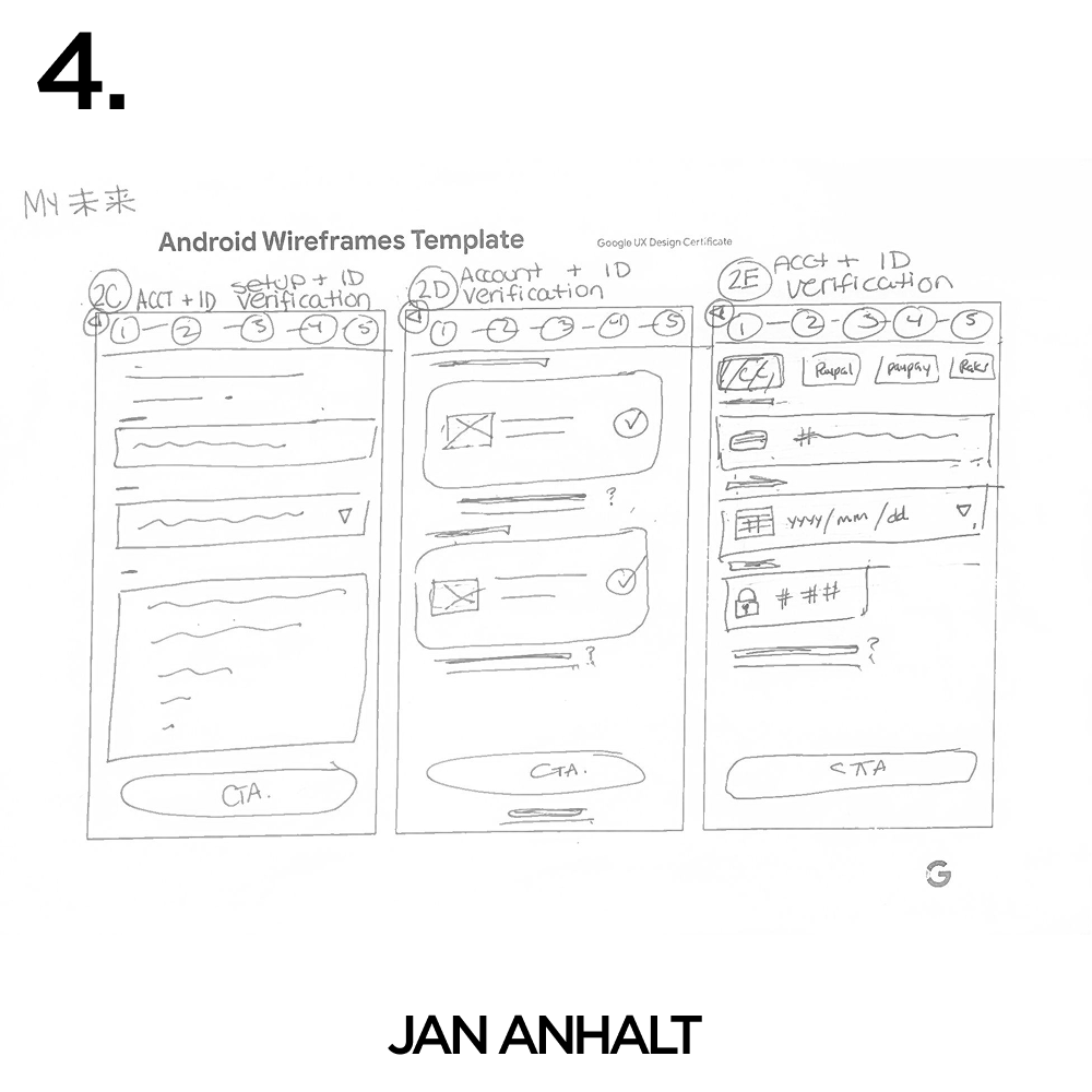
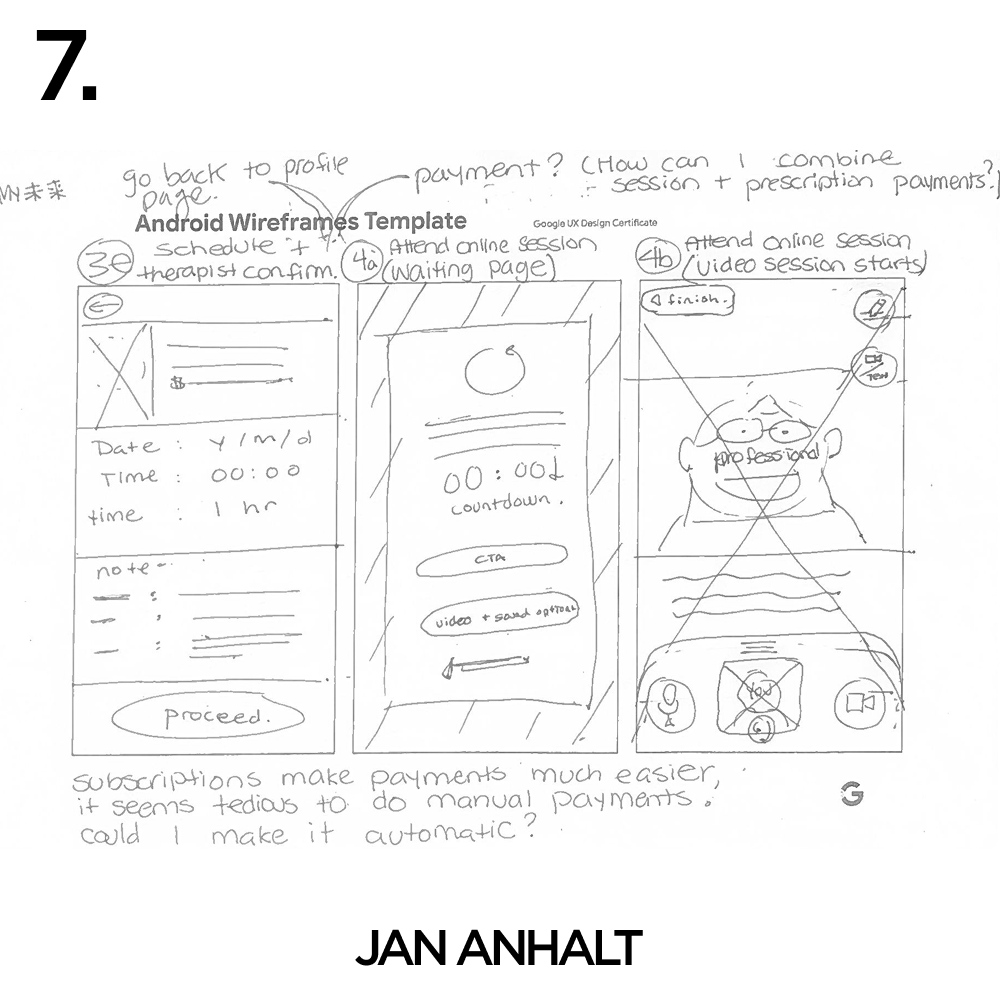
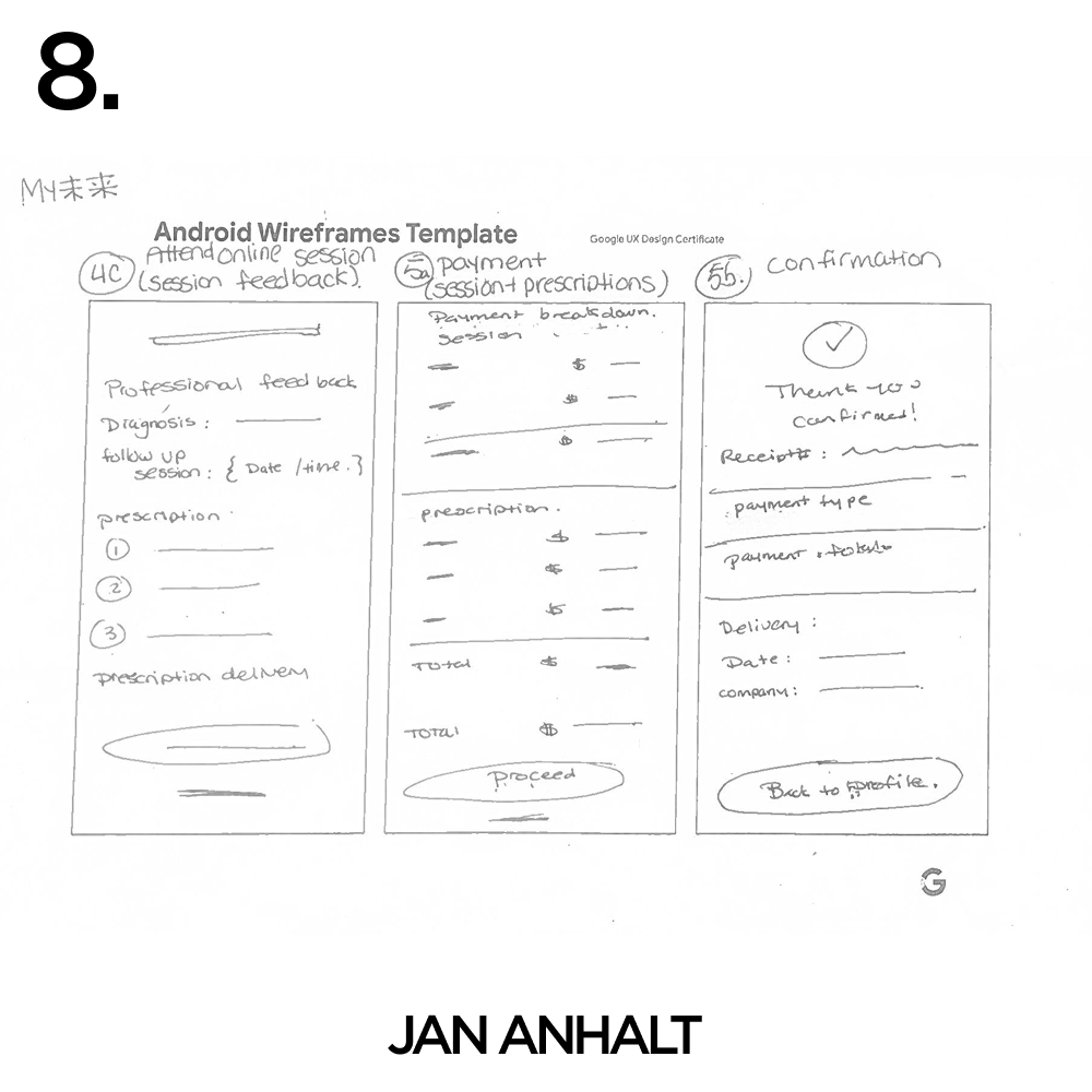
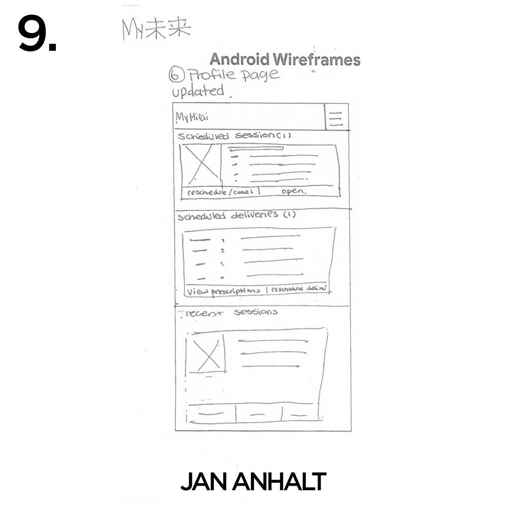
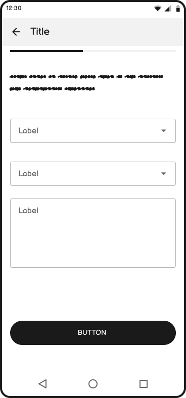
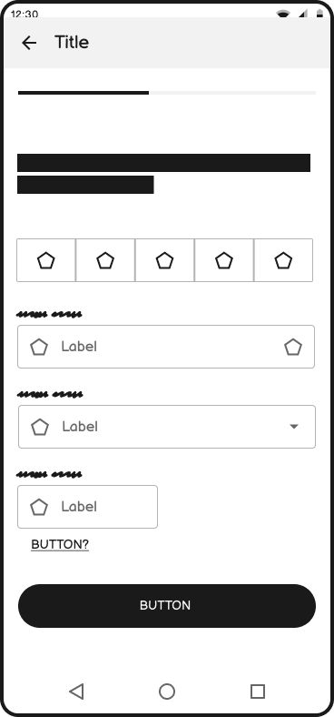
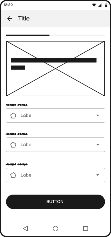
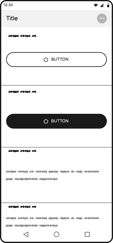
Wireframes | Paper
-
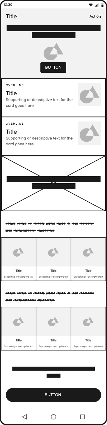
![UI Information Hierarchy]()
UI Information Hierarchy #1
-
![UI Information Hierarchy #2]()
UI Information Hierarchy #2
-
![Paper Wireframe #1]()
Paper Wireframe #1
-
![Paper Wireframe #2]()
Paper Wireframe #2
-
![Paper Wireframe #3]()
Paper Wireframe #3
-
![Paper Wireframe #4]()
Paper Wireframe #4
-
![Paper Wireframe #5]()
Paper Wireframe #5
-
![Paper Wireframe #6]()
Paper Wireframe #6

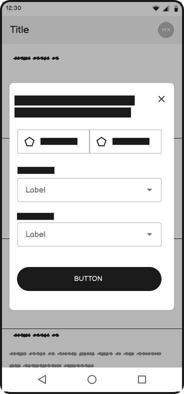
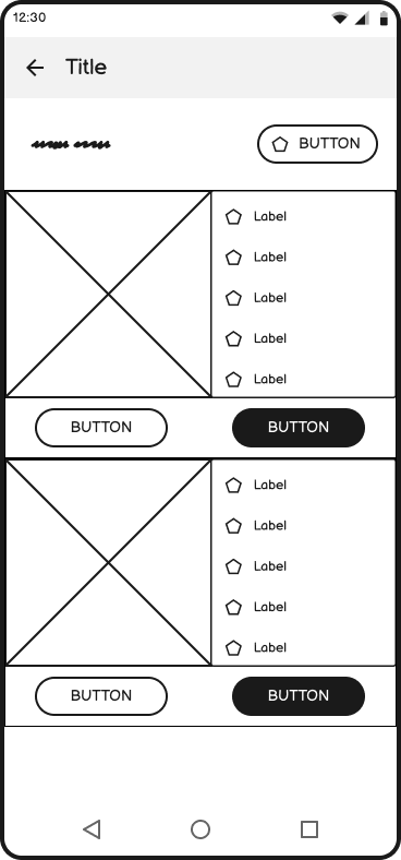
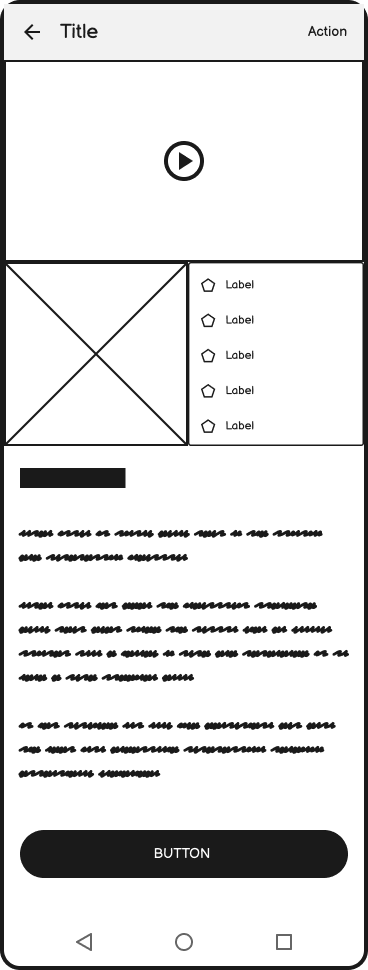
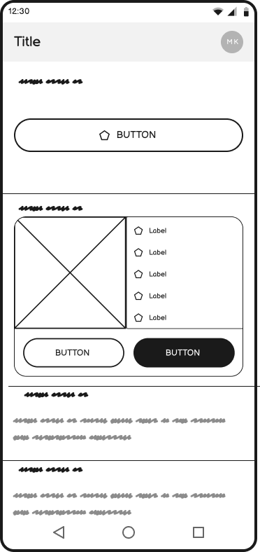
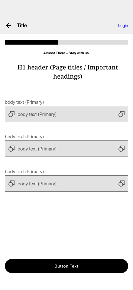
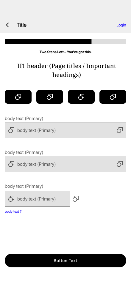
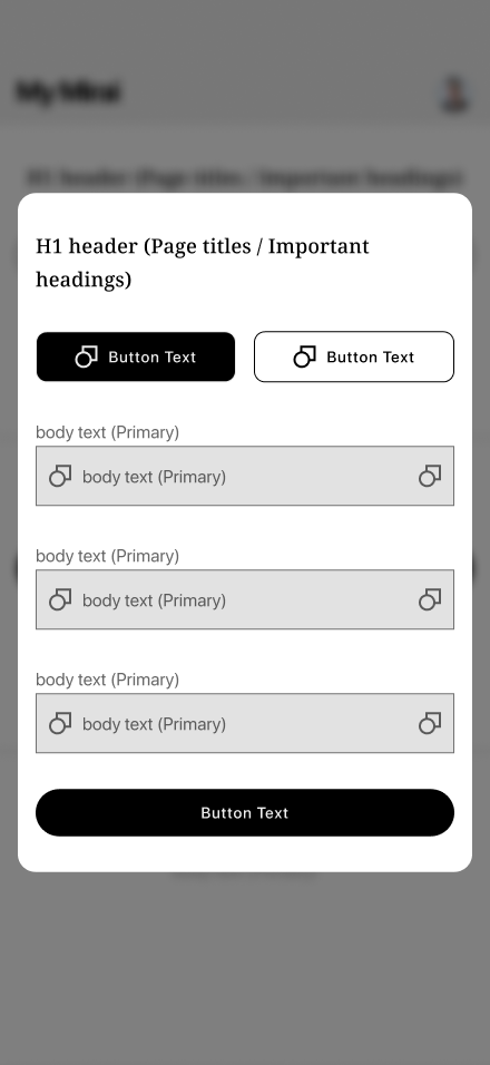
Wireframes | Digital
-
![]()
Landing Screen
-
![]()
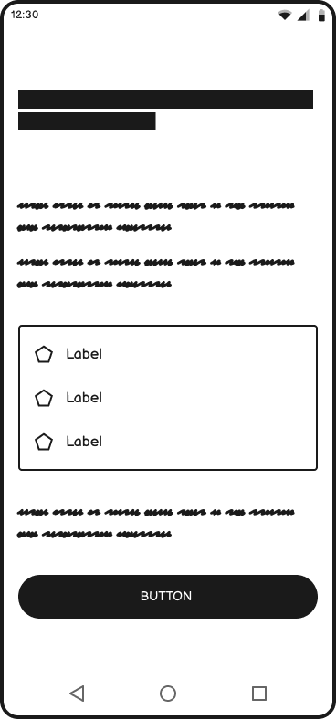
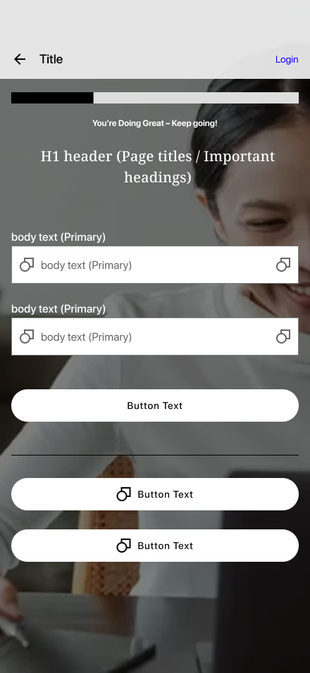
Onboarding Step 1 ーPreferences
-
![]()
Onboarding Step 2 ーSign Up
-
![]()
Onboarding Step 3 ーBackground
-
![]()
Onboarding Step 4 ーGovt ID Scan
-
![]()
Onboarding Step 5 ーBilling Details
-
![]()
Onboarding Step 7 ーGoals
-
![]()
Onboarding Step 8 ー Confirmation
-
![]()
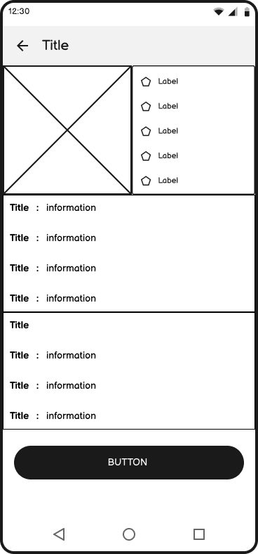
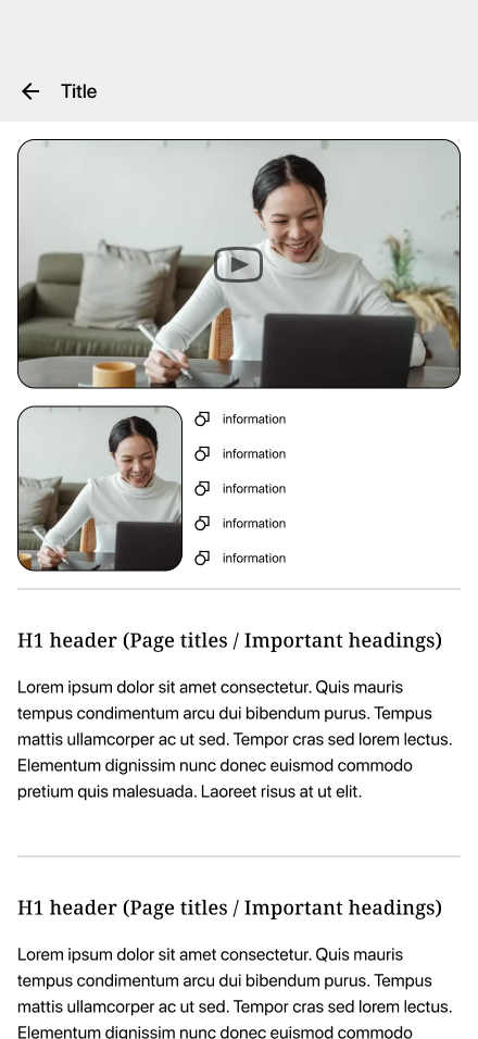
My Dashboard ー "My Session" Appointments & Records
-
![]()
Schedule a session ー Needs & Preferences
-
![]()
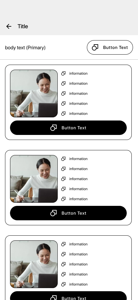
Schedule a session ー Lisiting Page
-
![]()
Schedule a session ー Professional Profile
-
![]()
My Dashboard ー My Session scheduled
-
![]()
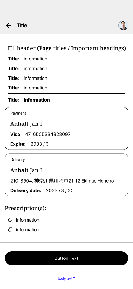
My Session ー Appointment Details
-
![]()
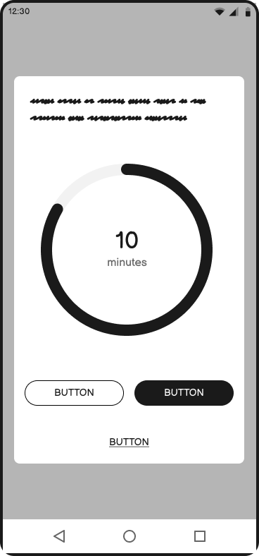
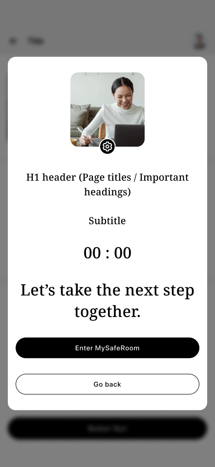
My Session ー Waiting Room
-
![]()
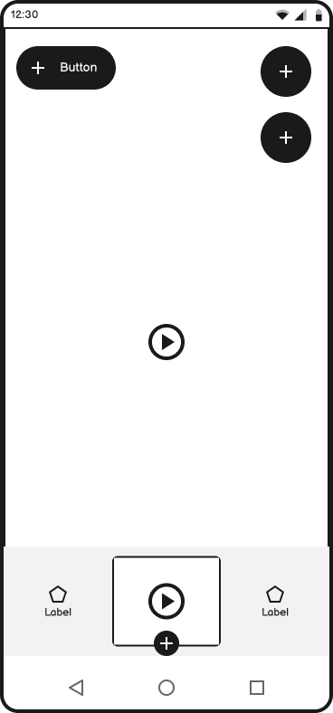
My Session ー Videophone
-
![]()
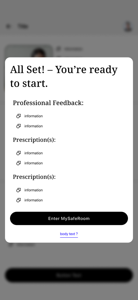
My Session ー Recap
-
![]()
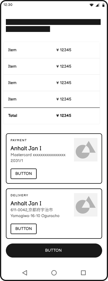
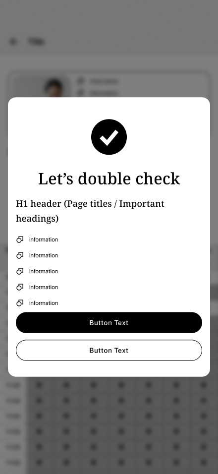
My Session Checkout ー View & Change Details
-
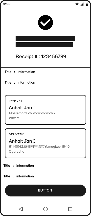
![]()
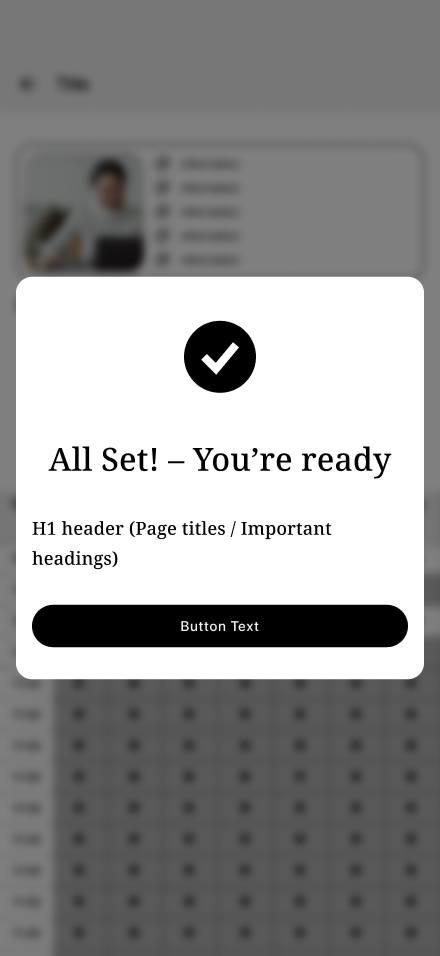
My Session Checkout ー Confirmation
-
![]()
My Dashboard ー Updated


The Solution
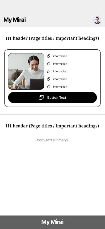
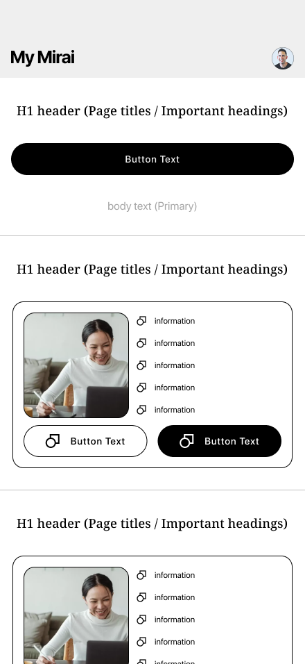
MyMirai is an online mental health platform purpose-built for English speakers in Japan, offering therapy, psychiatric care, and scheduling in a language and system they understand.
Through user-centered UX design, the platform simplifies complex processes like insurance integration and My Number ID verification, while enabling personalized provider matching based on preferences.
Every design choice—from onboarding flow to content tone—is intentional, reducing friction and emotional stress. The result is a culturally sensitive, intuitive experience that makes accessing mental health care feel safe, supportive, and seamless.

Low Fidelity
-
![]()
Landing Screen
-
![]()
Onboarding Step 1 ーPreferences
-
![]()
Onboarding Step 2 ーSign Up
-
![]()
Onboarding Step 3 ーBackground
-
![]()
Onboarding Step 4 ーGovt ID Scan
-
![]()
Onboarding Step 5 ーBilling Details
-
![]()
Onboarding Step 7 ーGoals
-
![]()
Onboarding Step 8 ー Confirmation
-
![]()
My Dashboard ー "My Session" Appointments & Records
-
![]()
Schedule a session ー Needs & Preferences
-
![]()
Schedule a session ー Lisiting Page
-
![]()
Schedule a session ー Professional Profile
-
![]()
Schedule a session ー Availability
-
![]()
Schedule a session ー Review
-
![]()
Schedule a session ー Confirmation
-
![]()
My Dashboard ー My Session scheduled
-
![]()
My Session ー Appointment Details
-
![]()
My Session ー Waiting Room
-
![]()
My Session ー Videophone
-
![]()
My Session ー Recap
-
![]()
My Session Checkout ー View & Change Details
-
![]()
My Session Checkout ー Confirmation
-
![]()
My Dashboard ー Updated


Research Results
User Interviews (Qualitative)
Participants: 8
Format: 1:1 in-person
Goal: Explore personal experiences, emotions, and expectations.
Online Survey (Quantitative)
Participants: 20
Tool: Google Forms
Goal: Validate interview findings at scale, gather trends and patterns

Interviews and surveys revealed that English-speaking residents in Japan often feel overwhelmed by the mental health system due to language barriers, unclear processes, and difficulty finding trusted professionals. Many participants expressed hesitation or gave up seeking care because of confusion around insurance, scheduling, or cultural stigma. There was a strong desire for a platform that offered support in English, simplified access to therapy and medication, and felt emotionally safe and easy to navigate. These insights directly informed the design of MyMirai’s core features and tone.
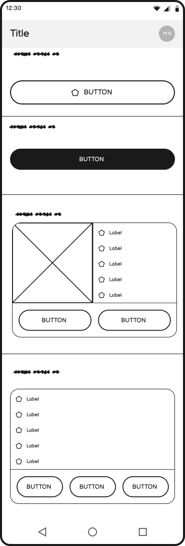
High Fidelity Prototype
What I learned
Color scheme felt clinical: Users associated bright green and white with hospitals; preferred natural, muted tones—but didn’t view color as a critical usability issue.
Keep It Simple, Stupid (K.I.S.S.): Simplicity was essential to reduce cognitive load for emotionally vulnerable users.
Empowerment through choice: Users valued autonomy—being able to define preferences and needs made the experience feel more personal and supportive.
Lack of confirmation caused uncertainty: Users wanted clearer feedback that actions (e.g., bookings) were successfully completed—especially important in mental health contexts.
Integrating National Health Insurance & My Number Card: Identified a UX opportunity to reduce friction by enabling insurance scanning during onboarding.
In-person interviews revealed deeper insights: Face-to-face conversations were more emotionally revealing than remote interviews.
Users preferred a familiar subscription model over a traditional checkout; Since the process is longer, insurance breakdowns added clarity and justified the process—highlighting the importance of transparency in payment design.
Progress indicators improved engagement: Users appreciated visual cues and supportive microcopy during onboarding—it kept them motivated and oriented.
To view these summarized insights in greater depth, please refer to the full case study, where each topic is explored with detailed context, research findings, and design rationale.
Got a minute? Before you connect with me on LinkedIn. Check out my case study and leave your thoughts!
Questions
Subscription vs. E-commerce Checkout
Can a mental health platform maintain high satisfaction using a traditional checkout flow, or is a subscription model better suited for emotional and long-term care needs?Building Trust Through UX
What simple, short-term UX design elements—beyond reviews and credentials—can effectively build user trust and engagement?Cross-Cultural Design Adaptability
Can a UX/UI originally designed for foreign users in Japan be successfully adapted for a native Japanese audience without losing usability or cultural sensitivity?High-Stakes Transaction Concerns
How can a platform mitigate user dissatisfaction or errors in high-stakes sessions (e.g., therapy or prescriptions), and how might a subscription model better support flexibility and trust?Support in the User Journey
Where is user support most critical in the mental health journey—and how can emotional hesitations be addressed through a phased UX flow?
Example:
Proof → Promise → Pain → Plan → Inform → Deliver → Adjust → Repeat
Do Me a Favour!

“If you can, take a quick second to connect with me on LinkedIn —it would mean the world to me! And if you have any feedback, feel free to contact me using the link below.”
