


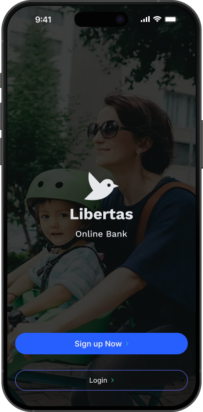
Libertas
Finally, an online bank in Japan for Foreign Residents.
Overview
Designing Libertas: A Mobile-First Banking Platform for Foreigners in Japan
Creating an inclusive, English-first banking experience to empower non-Japanese residents to manage finances with confidence.
Key Details:
Role: UX Researcher & Designer (end-to-end process: research, ideation, prototyping, testing).
Team: Solo project (conceptual case study).
Timeline: 3 weeks.
Tools: Figma, FigJam, Google Form, Zoom
Deliverables: User personas, journey maps, wireframes, high-fidelity prototypes, competitive analysis.
Problem Statement
Foreign residents in Japan, aged 20–50, face significant barriers to banking due to language issues, cultural differences, and outdated digital interfaces. These challenges lead to frustration, anxiety, and distrust, with 80% of interviewed users reporting confusion during onboarding and dissatisfaction with legacy systems.
Goal: Design a mobile-first, English-first banking platform (Libertas) that simplifies account setup, financial management, and investment for foreigners, fostering trust and inclusion while aligning with Japan’s banking regulations.

Research & Insights
Research Methods:
Conducted semi-structured Zoom interviews with 5 foreign residents (UK, Singapore, Canada, India, USA; aged 20–50).
Analyzed competitors (Wise, Revolut, Sony Bank, SMBC Prestia) via a SWOT matrix.
Developed empathy maps, personas, and user journeys based on Nielsen Norman Group frameworks.
Key Findings:
Language Barriers: 100% of participants struggled with Japanese-only forms or notifications (e.g., “I felt like I was taking a test I didn’t study for” – Participant #5).
Poor UX: 80% found existing banking apps outdated or unintuitive (e.g., “Most Japanese banks feel like they’re stuck in 2005” – Participant #1).
Trust Issues: 60% expressed skepticism about data privacy and customer support accessibility.
Diverse Needs: Users split into three groups: Digital Natives (modern UX), Practical Expats (business needs), and Newcomers (simplicity).

Empathy Map
Empathy Maps:
Capturing the thoughts, feelings, actions, and words of participants to understand their banking frustrations and design a user-centered solution for foreigners in Japan.
Personas
Personas:
Beth, Daniel, and Riley represent diverse foreign residents in Japan, capturing their unique banking needs—from modern UX and business tools to simple, English-first onboarding.
Ideate Solutions
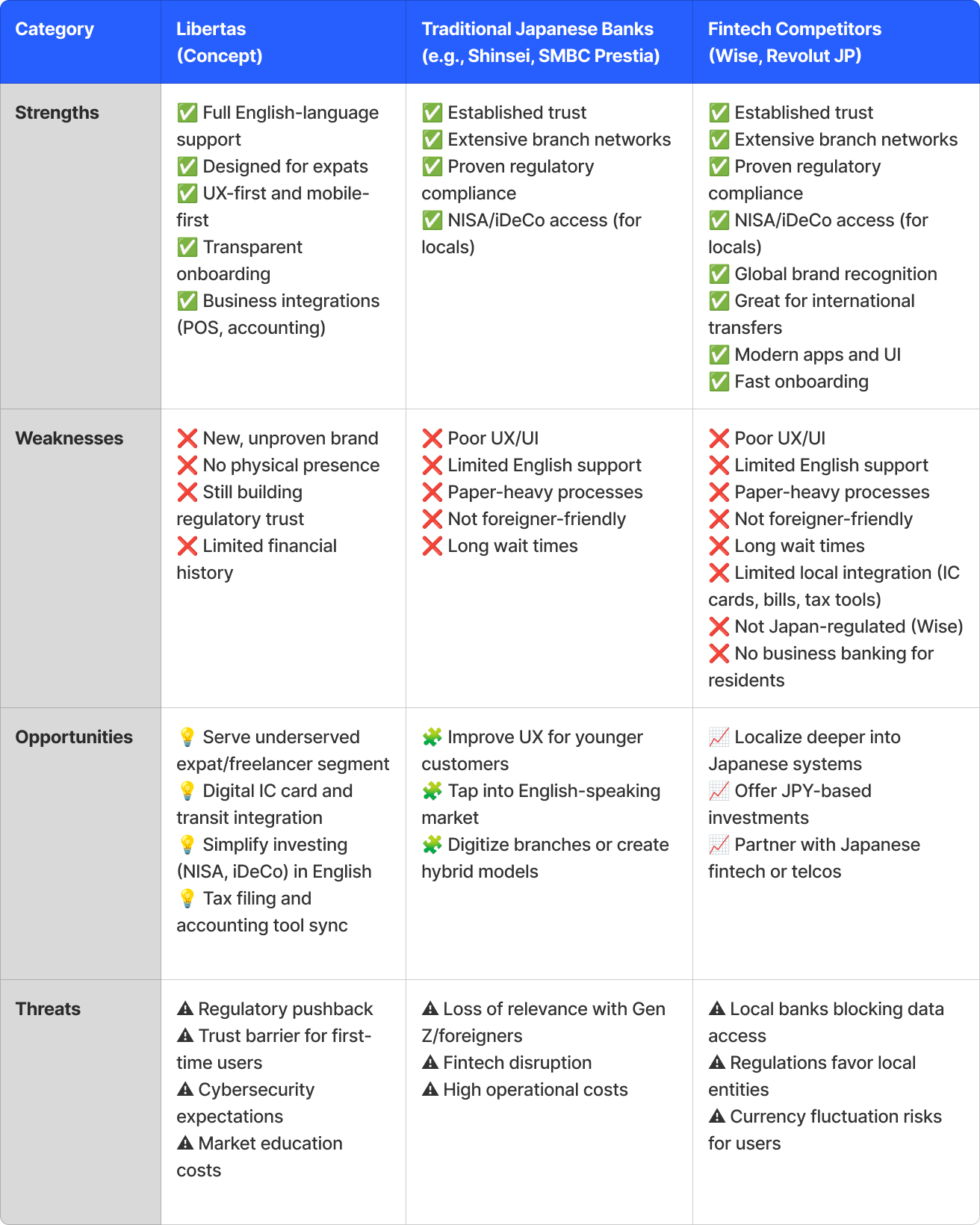
To ideate effective solutions, I first researched Libertas’s direct and indirect competitors. I developed a direct competitor analysis matrix to visually identify key gaps and opportunities, which informed a list of 10 ways Libertas could differentiate itself. Building on that, I conducted a SWOT analysis to evaluate Libertas’s strengths, weaknesses, opportunities, and threats in comparison to its competitors. These insights led to 10 strategic opportunities for Libertas to stand out, deliver stronger user value, and establish a unique position in the market.
Direct Competition

Wise
Offers multi-currency accounts and low-fee international transfers; great UX; widely used by expats.

Revolut Japan
Fully digital bank-like services, supports multiple currencies, user-friendly UI, English support.

Sony Bank WALLET
Offers English-language website and support, international Visa card, and online banking features.

Prestia Trust Bank
Known for full English banking services (customer service, online banking), popular among long-term foreign residents.

Shinsei Bank
Offers foreign currency accounts and some English support; popular with foreign residents.

PayPay Bank
Mobile-first experience, gaining popularity among tech-savvy users in Japan.
SWOT Analysis
Design Process
Ideation:
Brainstormed solutions using Figma(FigJam) for affinity mapping, focusing on user pain points (e.g., complex onboarding, lack of English support).
Sketched initial concepts for a mobile-first interface with visa-aware onboarding and Suica integration.
Wireframes:
Created low-fidelity wireframes in Figma for key flows: account setup, dashboard, and investment tools.
Focused on minimalist design with clear CTAs and Language toggle button.
Prototyping:
Built interactive prototypes in Figma, testing features like:
Foreigner-Friendly Onboarding
Real Human Support Video calls (in English)
Real Human Support Video Messaging (in English)
Iterations:
Conducted usability testing with 3 participants (P#1, P#3, P#5).
Feedback: “Pop-up tooltips were helpful but felt cluttered” (P#5). Simplified tooltips and added a “Hide Tips” option.

Affinity Diagram
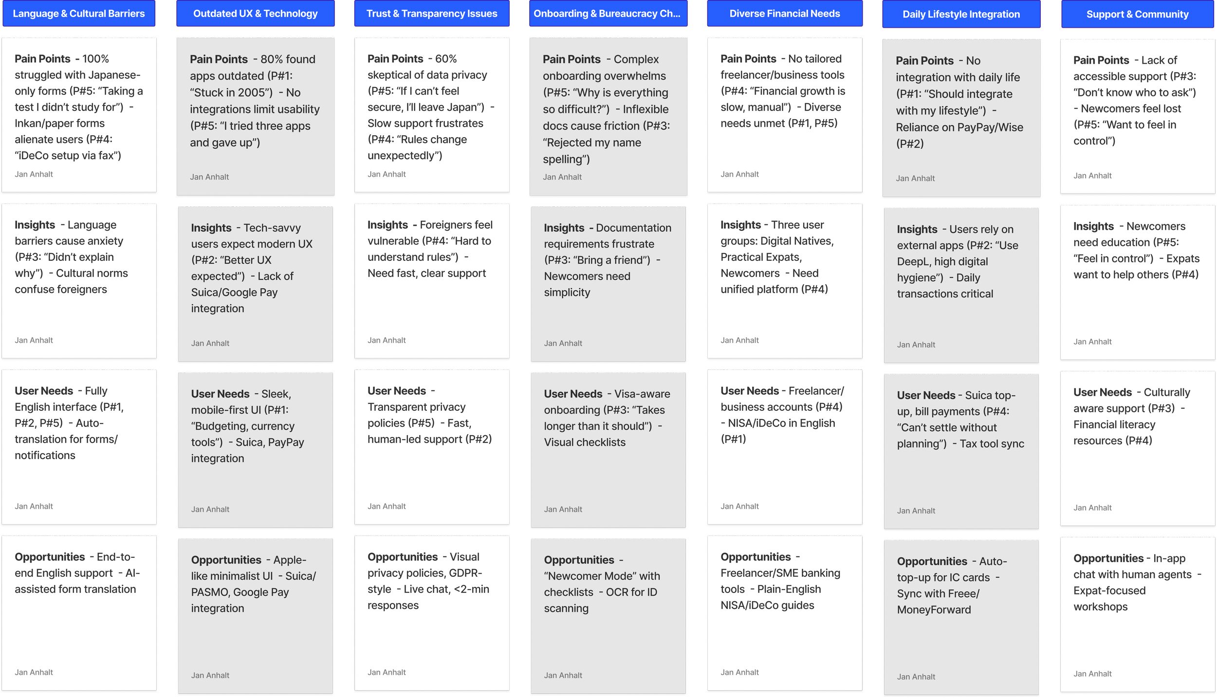
Affinity diagram synthesizing interview insights to identify design opportunities for Libertas
High Fidelity Prototype
Visual Design:
Typography: Sans-serif fonts (e.g., Inter) for readability.
Colors: Blue and white palette for trust; green accents for success states.
Branding: Friendly, inclusive tone with a logo symbolizing freedom (Latin: Libertas).
Impact and Results
Metrics (based on prototype testing):
Onboarding Completion: 85% of users completed setup in <10 minutes (vs. 30+ minutes for competitors).
User Satisfaction: 4.5/5 rating for ease of use in testing.
Support Resolution: 90% of mock support queries resolved via in-app chat in <2 minutes.
Qualitative Feedback:
“This feels like an app I’d actually use daily” (P#1).
“Finally, a bank that doesn’t make me feel stupid” (P#5).
Reflection:
Learned: Balancing simplicity with robust features is key for diverse user groups.
Next Steps: Test with larger sample; explore partnerships with PayPay and Freee for deeper integration.
Takeaways
The the research reveal that foreigners in Japan face language barriers, outdated UX, and trust issues in banking, driving the need for Libertas—a mobile-first, English-first platform with seamless onboarding, lifestyle integrations, and responsive support tailored to diverse expat needs.
I initially underestimated the complexity of designing an intuitive information architecture and crafting a warm, inviting onboarding screen for Libertas, realizing that creating a truly inclusive and user-friendly experience for foreigners navigating Japan’s banking challenges demands significantly more time, iteration, and refinement than anticipated, highlighting the need for ongoing design work to perfect the platform’s accessibility and welcoming feel.

Do Me a Favour!
“If you can, take a quick second to connect with me on LinkedIn —it would mean the world to me! ”

Other Projects
-
![]()
CS2 | My Mirai
-
![]()
CS1 | EZ APP

