Project Snapshot
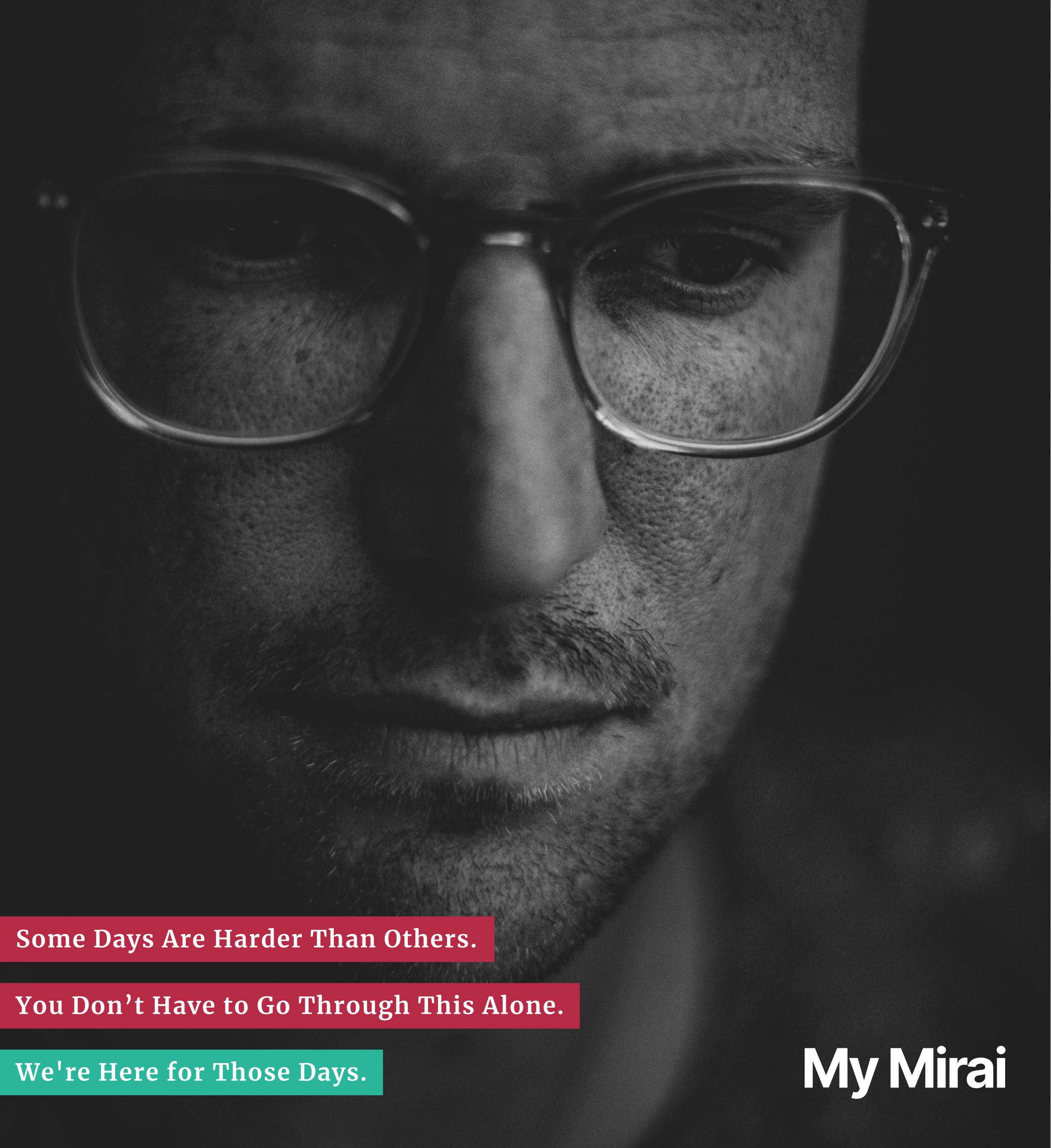
MyMirai is a UX design project for an online mental health platform built for English speakers living in Japan. It addresses the core problems these users face: language barriers, cultural stigma, difficulty navigating Japan’s healthcare system, and lack of accessible, trustworthy mental health support.
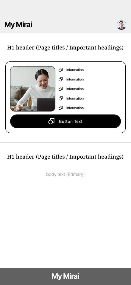
MyMirai offers therapy, psychiatric care, and scheduling—all in English—with features like insurance integration, government I.D. verification, and personalized provider matching to make mental health care easier, safer, and more approachable for non-native residents.
THE PROBLEM
English-speaking residents in Japan often face significant challenges when seeking mental health support—including:
Language barriers
Unfamiliar healthcare processes
Limited access to English-speaking professionals
Cultural stigma around therapy
Accessing therapy services covered by health insurance
These issues create friction, confusion, and often lead to people giving up on care altogether. There is a clear need for a mental health platform that not only offers services in English but is also designed with cultural sensitivity, accessibility, and system navigation in mind.
THE SOLUTION
MyMirai is an online mental health platform purpose-built for English speakers in Japan, offering therapy, psychiatric care, and scheduling in a language and system they understand.
Through user-centered UX design, the platform simplifies complex processes like insurance integration and My Number ID verification, while enabling personalized provider matching based on preferences.
Every design choice—from onboarding flow to content tone—is intentional, reducing friction and emotional stress.
The result is a culturally sensitive, intuitive experience that makes accessing mental health care feel safe, supportive, and seamless.

OVERVIEW

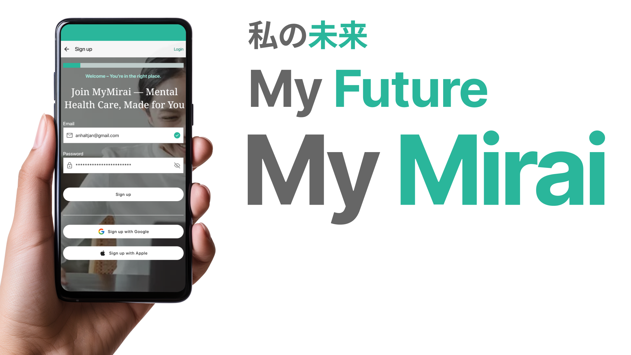
Project Name: My Mirai (My Future)
Platform: Mobile E-Commerce App
My Role: UX Designer (solo project)
Duration: 2 weeks
Tools: Figma, FigJam, Google (Docs, Sheets, Forms)
Type: This concept project was based on real user research and usability testing with random people on the street.
This conceptual project, grounded in real user research, was an intentional deep dive into the foundational phase of UX design—focusing not just on methods like surveys, interviews, and competitive analysis, but on developing the critical thinking, user empathy, and cultural awareness required to design with purpose and integrity for underserved users.
THE PROCESS
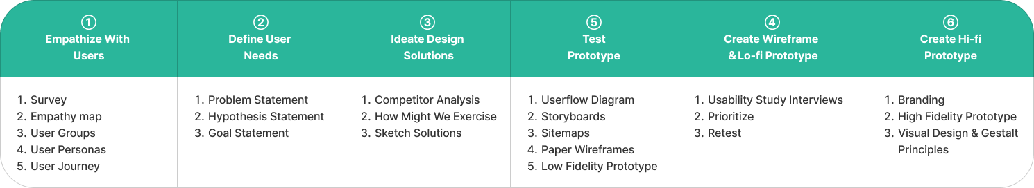
EMPATHIZE WITH USERS
Demographics:
English-speaking adults (21+) currently living in Japan
Diverse nationalities, genders, and occupations (e.g., students, teachers, expats, freelancers)
Immigrated to Japan, and holds at least a bachelor's degree or is currently attaining a degree in Japan
Contributes to Japan’s mandatory pension & healthcare insurance
Most users have some mental health support experience. For every 1 new user, there are about 1.6 experienced users.
ONLINE SURVEY
Participants: 20
Tool: Google Forms
Goal: To uncover and highlight the challenges users face in accessing mental health support, and to demonstrate the strong demand for a convenient, accessible online platform that meets these needs.
Qualitative: 10 multiple choice
Quantitative: 5 Long answer questions
Survey revealed that English-speaking residents in Japan often feel overwhelmed by the mental health system due to language barriers, unclear processes, and difficulty finding trusted professionals.
Many participants expressed hesitation or gave up seeking care because of confusion around insurance, scheduling, or cultural stigma.
There was a clear and strong desire for a platform that provides English-language support, simplifies access to therapy and medication, and creates an emotionally safe, easy-to-navigate experience.
These insights directly informed the design of MyMirai’s core features and tone.
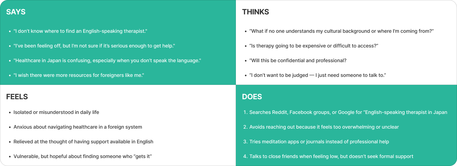
EMPATHY MAP (AGGREGATE)
PERSONAS
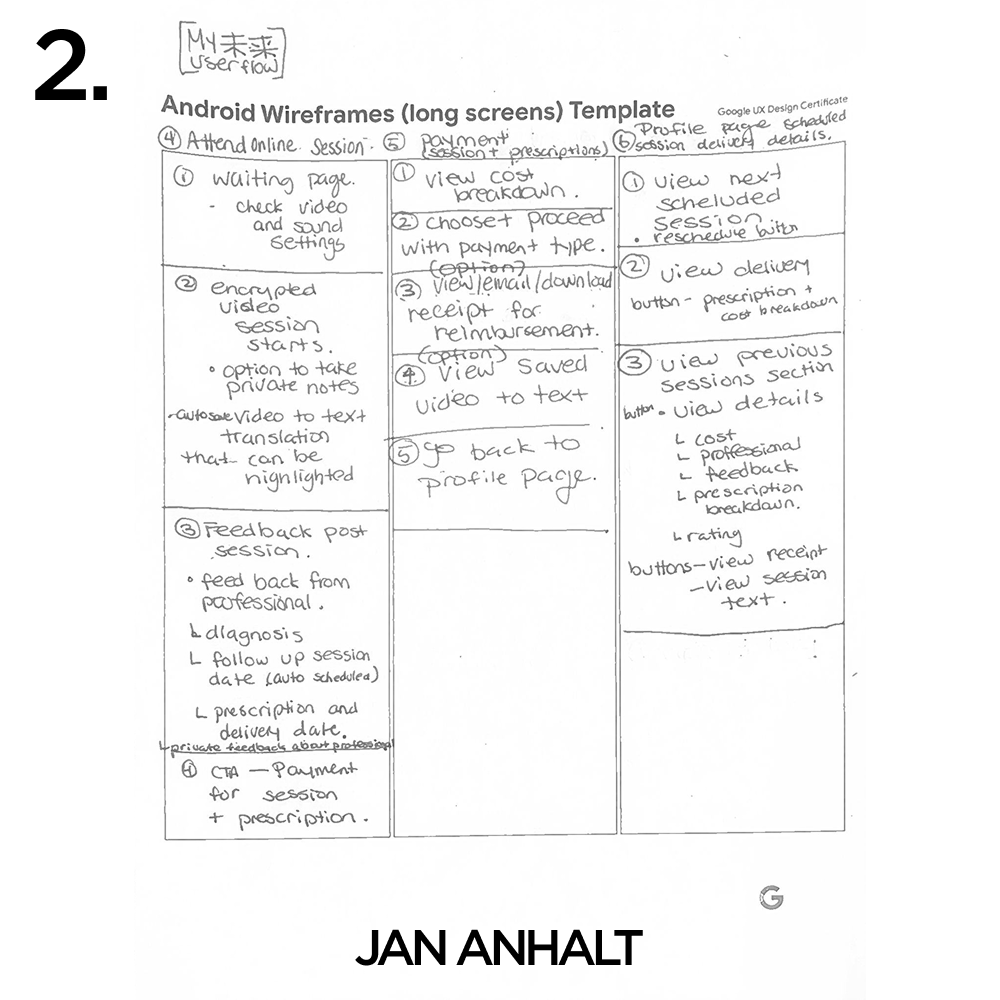
PAPER USERFLOW & WIREFRAMES
-
![UI Information Hierarchy]()
User Flow #1
-
![UI Information Hierarchy #2]()
User Flow #2
-
![Paper Wireframe #1]()
Paper Wireframe #1
-
![Paper Wireframe #2]()
Paper Wireframe #2
-
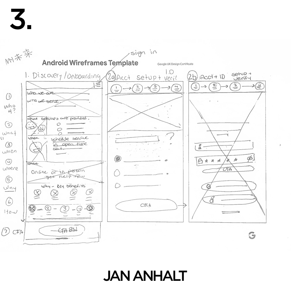
![Paper Wireframe #3]()
Paper Wireframe #3
-
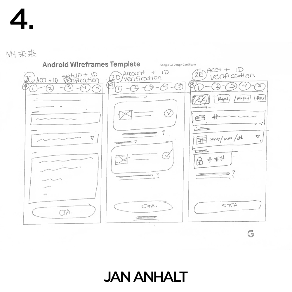
![Paper Wireframe #4]()
Paper Wireframe #4
-
![Paper Wireframe #5]()
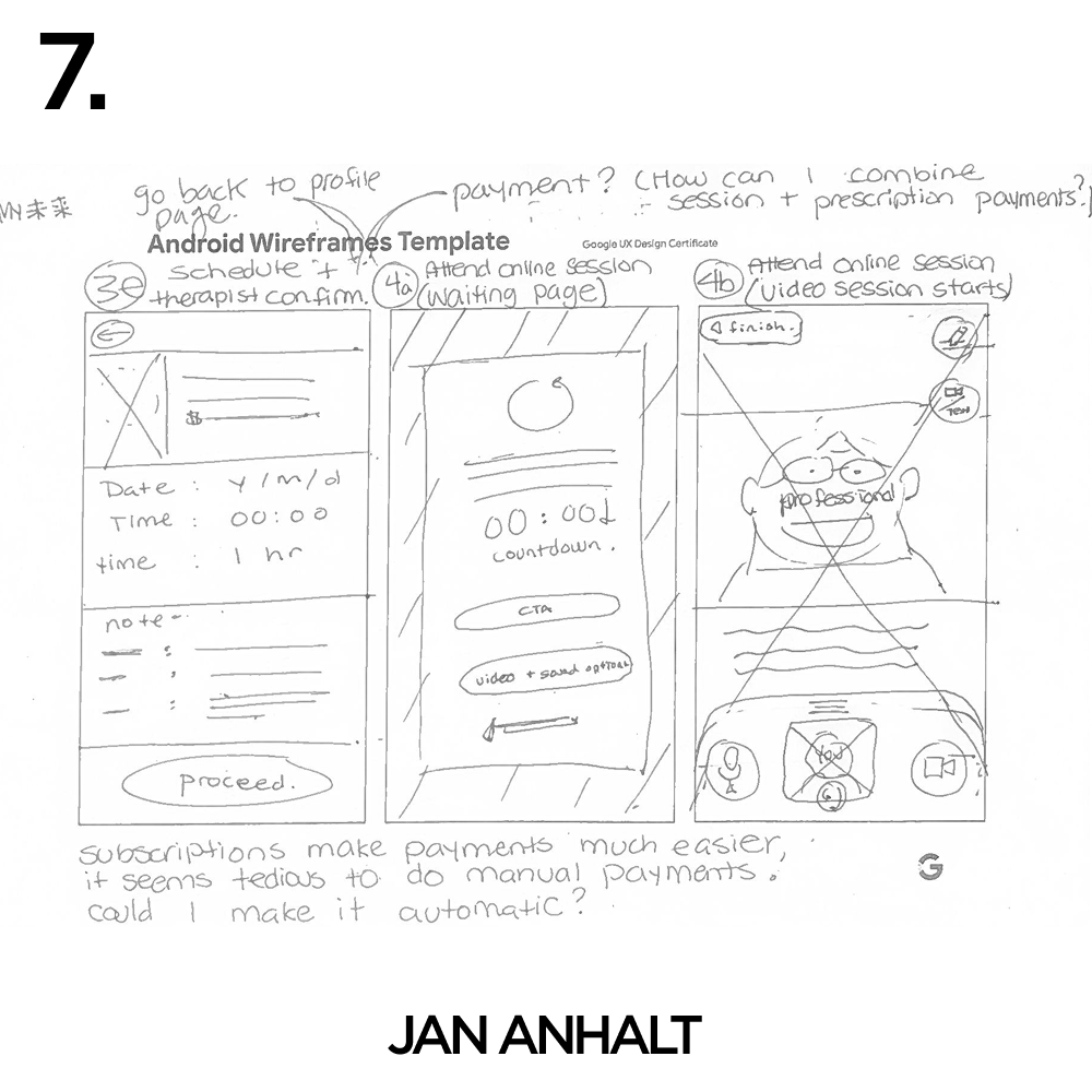
Paper Wireframe #5
-
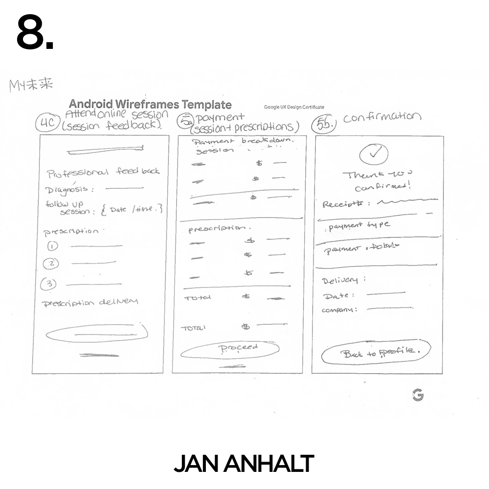
![Paper Wireframe #6]()
Paper Wireframe #6
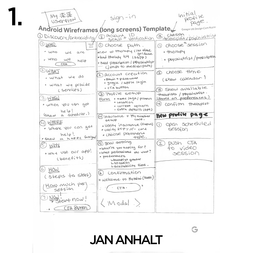

While designing EZ (Easy), I spent a significant amount of time not just mapping the overall user flow, but also learning how to structure and prioritize content within individual screens—an area I underestimated at first.
During the design process, I reflected deeply on how to work more efficiently when mapping user flows for each page.
Instead of immediately jumping into digital wireframing tools, I chose to first write out the user flow by hand. This tactile approach allowed me to slow down and thoughtfully consider each step from the user’s perspective, uncovering potential gaps and redundancies early on.
Once the flow was clearly articulated on paper, I found that translating it into wireframes became a far more intuitive and rapid process. This practice not only saved me about an hour of iterative revisions but also enhanced the clarity and coherence of the overall design.
Since formatting the Discovery page proved to be a major challenge, I leaned on the fundamental thinking I developed through building my luxury clothing brand and teaching—using the 5Ws (Who, What, When, Where, Why), along with ‘How’ and ‘Now’ to guide structure and clarity
Who – Who we are & who we help
What – What we do & what we provide
When – When you can get help
Where – Where you can get help
Why – Why you should use the app
How – How to get started
Now – Clear CTA button to take action
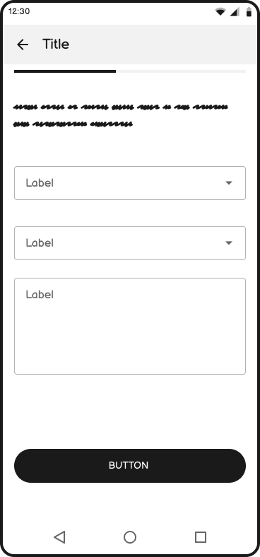
USER FLOW
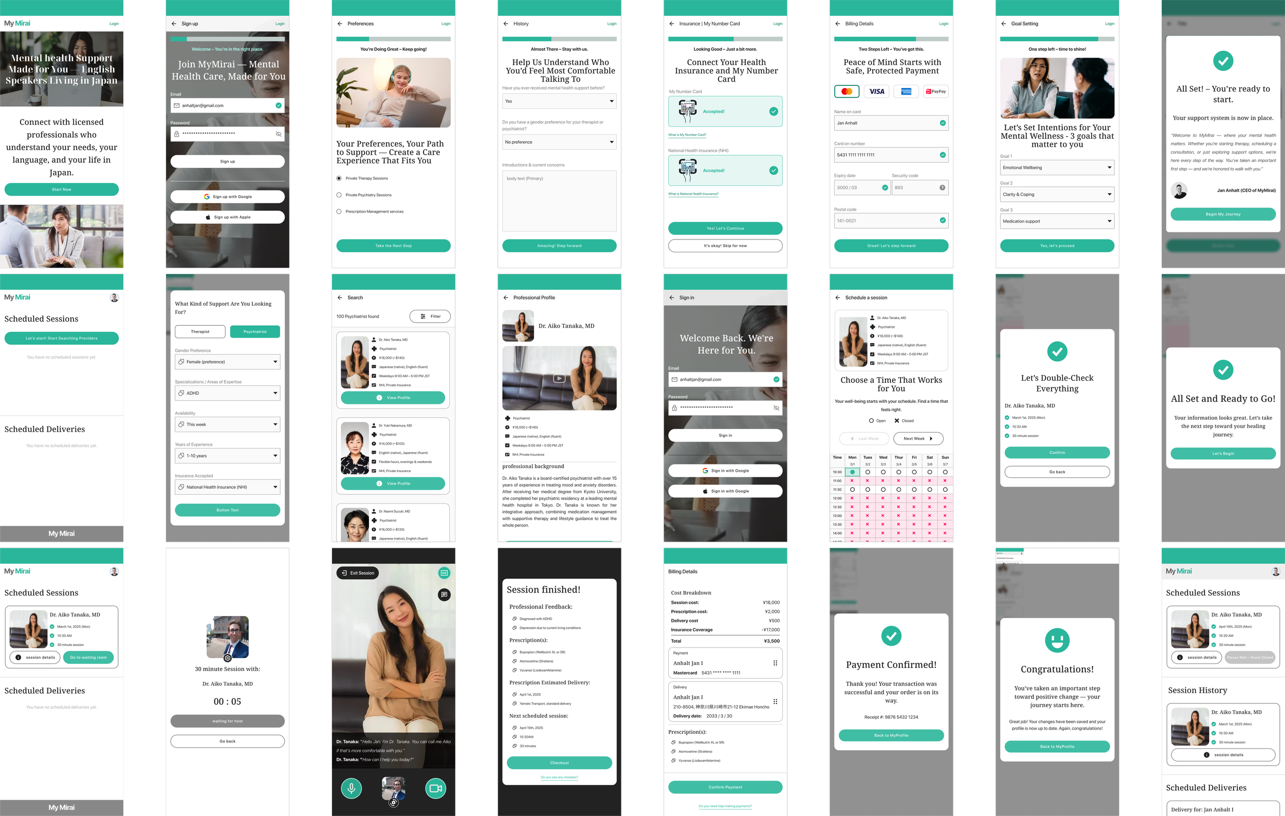
Wireframes | Digital
-
![]()
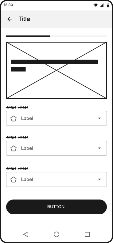
Landing Screen
-
![]()
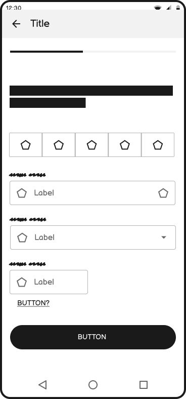
Onboarding Step 1 ーPreferences
-
![]()
Onboarding Step 2 ーSign Up
-
![]()
Onboarding Step 3 ーBackground
-
![]()
Onboarding Step 4 ーBilling Details
-
![]()
Onboarding Step 5 ーGoals
-
![]()
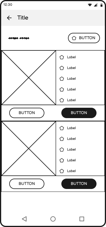
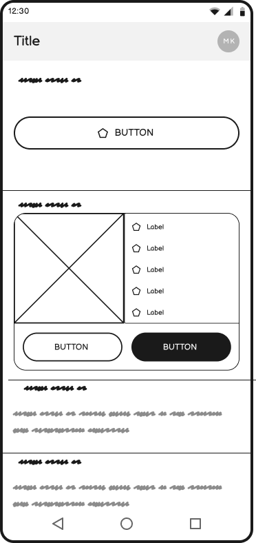
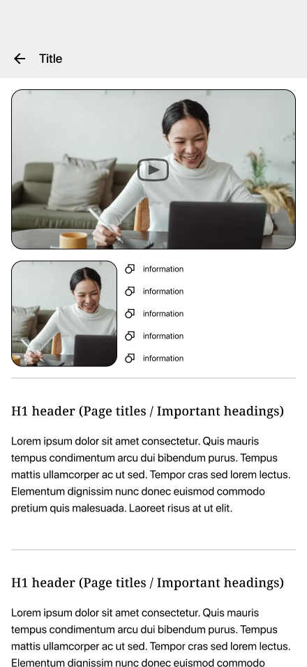
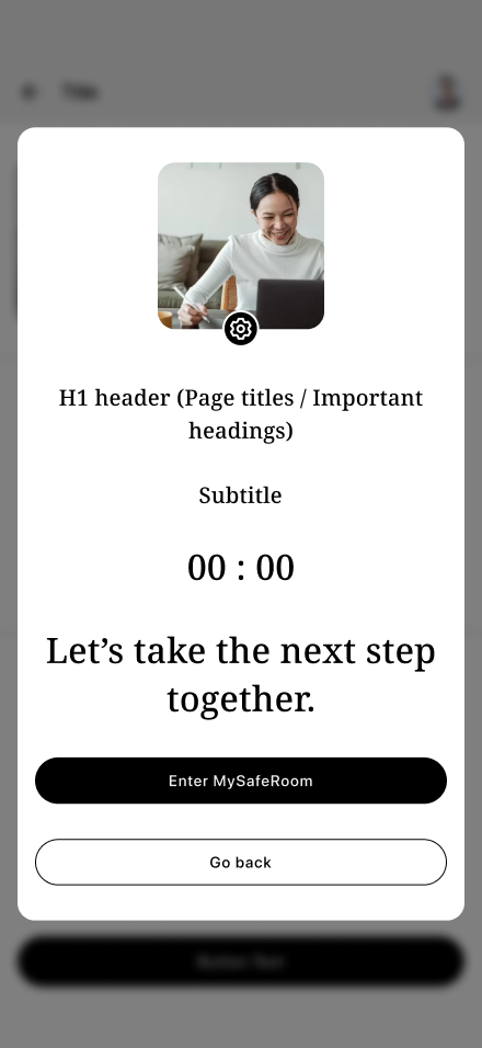
My Dashboard ー "My Session" Appointments & Records
-
![]()
Schedule a session ー Needs & Preferences
-
![]()
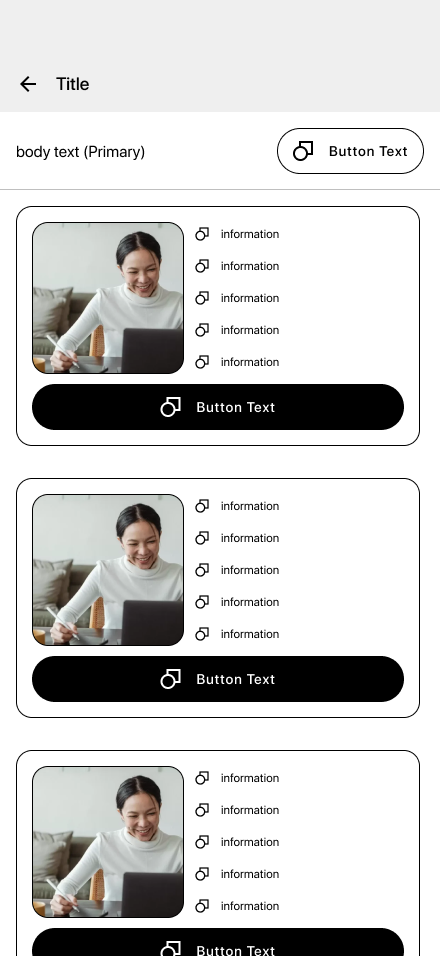
Schedule a session ー Lisiting Page
-
![]()
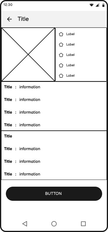
Schedule a session ー Professional Profile
-
![]()
My Dashboard ー My Session scheduled
-
![]()
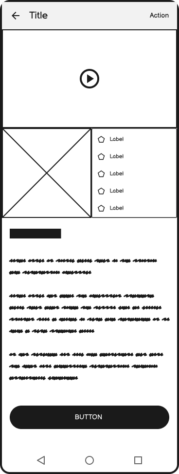
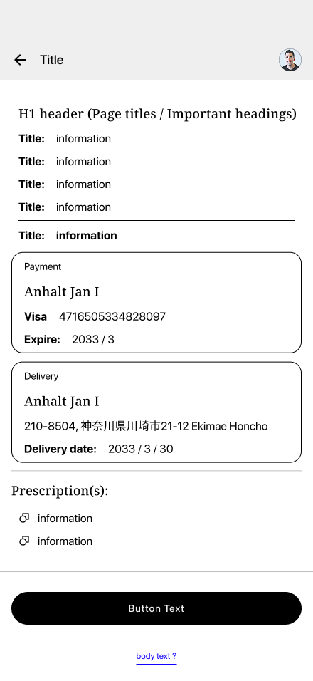
My Session ー Appointment Details
-
![]()
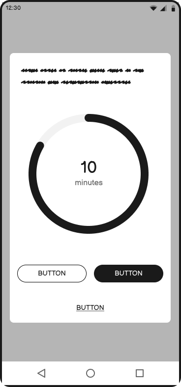
My Session ー Waiting Room
-
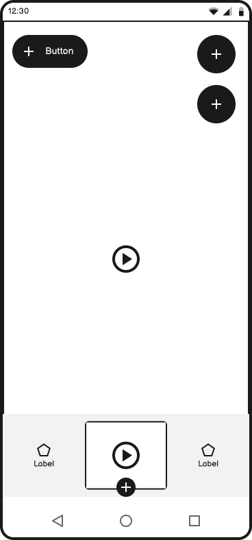
![]()
My Session ー Videophone
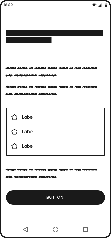
-
![]()
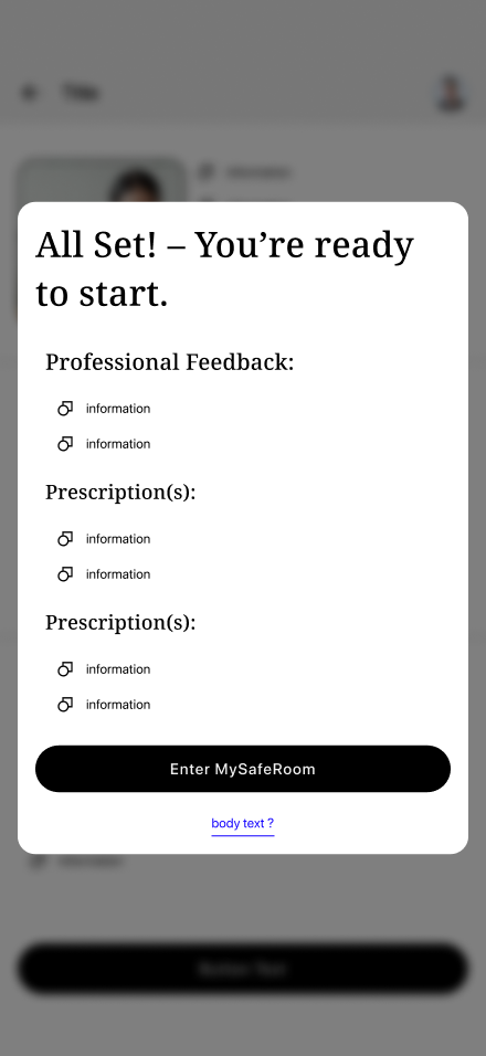
My Session ー Recap
-
![]()
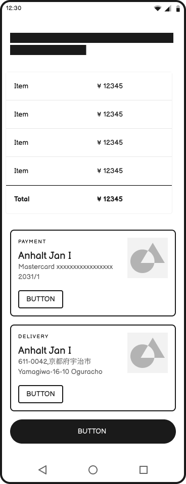
My Session Checkout ー View & Change Details
-
![]()
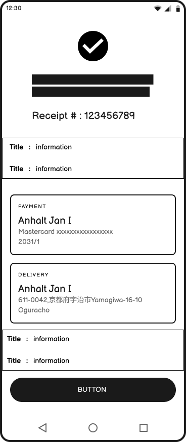
My Session Checkout ー Confirmation
-
![]()
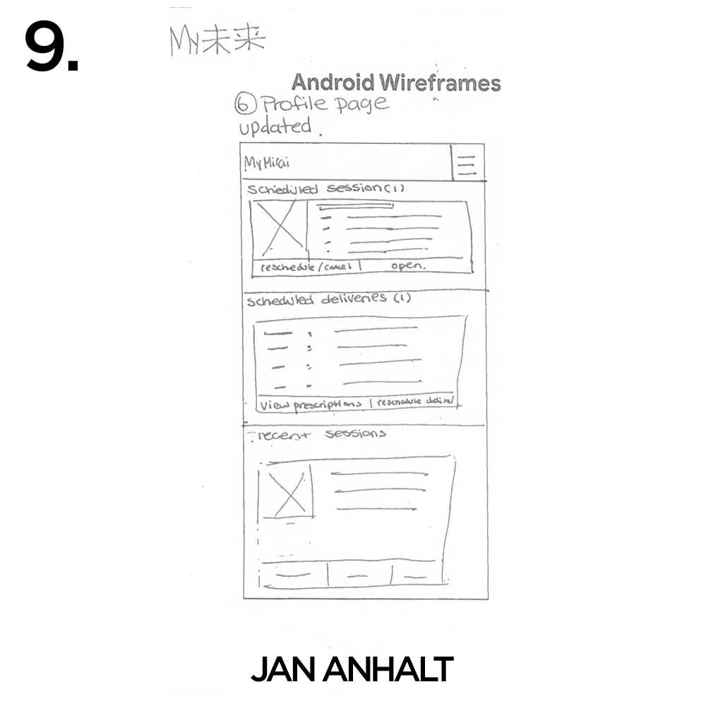
My Dashboard ー Updated
USABILITY TEST RESULTS
User In-Person Interviews
Participants: 8
Format: 1:1 in-person
Time: Afternoon
Location: Shibuya, Tokyo
Goal: To quickly gather authentic, real-time feedback from random English speakers in public settings.
Incentive: ¥2000 Starbucks giftcard
Interview Feedback
Color scheme felt clinical: Users associated bright green and white with hospitals; preferred natural, muted tones—but didn’t view color as a critical usability issue.
Simplicity is crucial: Participants emphasized that a simple design is essential to reduce cognitive load, especially for emotionally vulnerable users.
Empowerment through choice: Users valued autonomy; allowing them to set preferences and needs made the experience feel personalized and supportive.
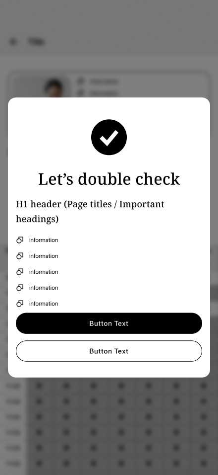
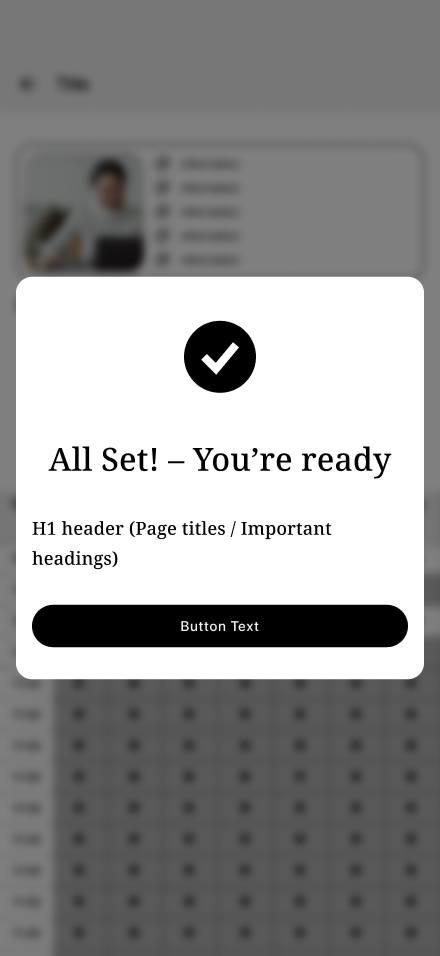
Need for clear confirmation: Participants expressed uncertainty when actions like bookings lacked clear feedback, underscoring the importance of confirmation in mental health contexts.
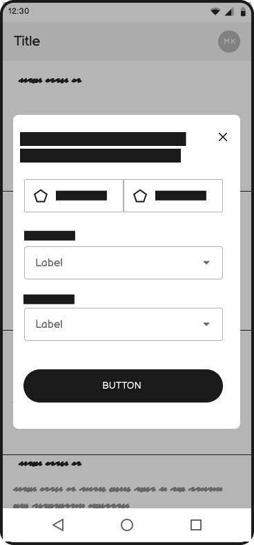
Opportunity in insurance integration: Incorporating National Health Insurance and My Number Card scanning during onboarding was seen as a key way to reduce friction.
Value of in-person interviews: Face-to-face sessions revealed deeper, more emotional insights than remote methods.
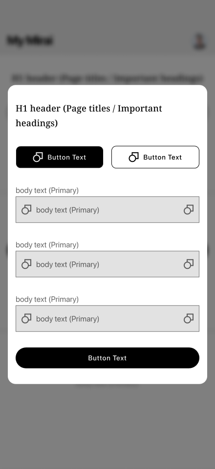
Preference for subscription models: Users favored a subscription-based approach over traditional checkout, with insurance cost breakdowns providing clarity and justifying longer processes—highlighting transparency’s role in payment design.
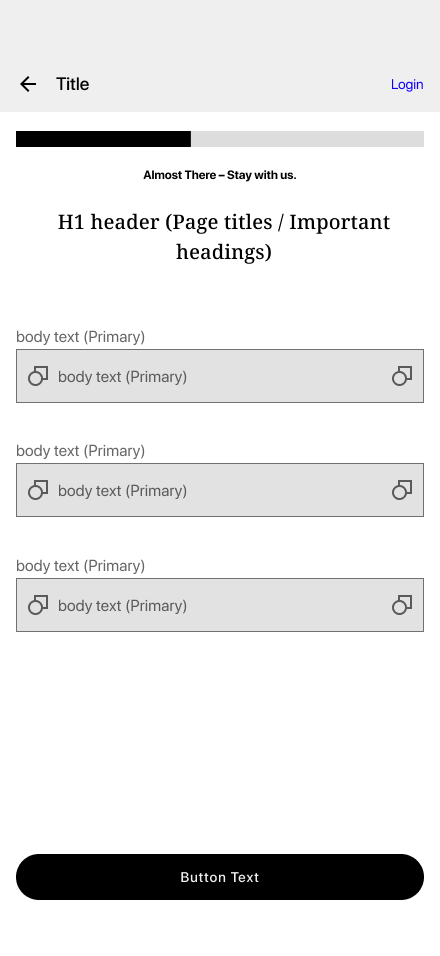
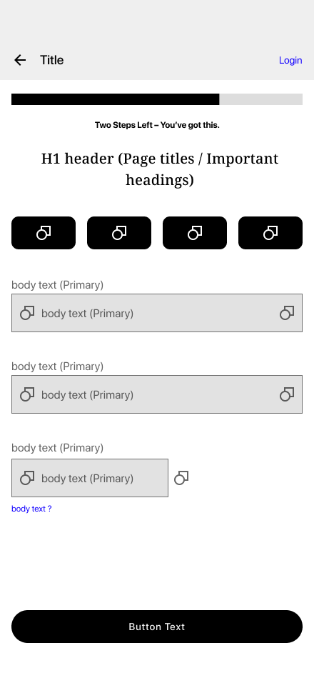
Progress indicators boost engagement: Visual progress bars and supportive microcopy during onboarding helped maintain motivation and orientation.
Suggestion from participant: A separate page was created for users to view and choose available time slots by week. This streamlined the booking process, reduced cognitive load, and allowed users to focus solely on scheduling without distractions from other onboarding elements.

Low Fidelity
-
![]()
Landing Screen
-
![]()
Onboarding Step 1 ーPreferences
-
![]()
Onboarding Step 2 ーSign Up
-
![]()
Onboarding Step 3 ーBackground
-
![]()
nboarding – Step 4: Government ID Scan (Added Post-Usability Testing)
-
![]()
Onboarding Step 5 ーBilling Details
-
![]()
Onboarding Step 7 ーGoals
-
![]()
Onboarding Step 8 ー Confirmation (Added Post-Usability Testing)
-
![]()
My Dashboard ー "My Session" Appointments & Records
-
![]()
Schedule a session ー Needs & Preferences
-
![]()
Schedule a session ー Lisiting Page
-
![]()
Schedule a session ー Professional Profile
-
![]()
Schedule a session ー Availability (Added Post-Usability Testing)
-
![]()
Schedule a session ー Review (Added Post-Usability Testing)
-
![]()
Schedule a session ー Confirmation (Added Post-Usability Testing)
-
![]()
My Dashboard ー My Session scheduled
-
![]()
My Session ー Appointment Details
-
![]()
My Session ー Waiting Room
-
![]()
My Session ー Videophone
-
![]()
My Session ー Recap
-
![]()
My Session Checkout ー View & Change Details
-
![]()
My Session Checkout ー Confirmation
-
![]()
My Dashboard ー Updated


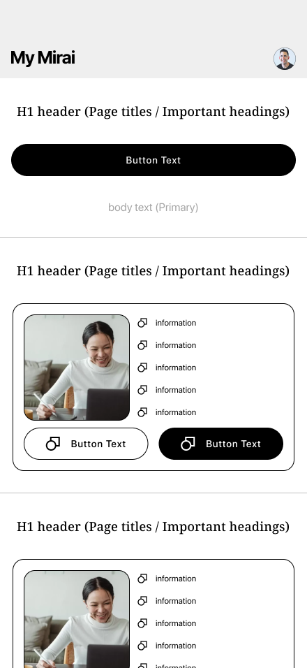
High Fidelity Prototype

SELF-REFLECTION
Subscription vs. E-commerce Checkout
Can a mental health platform sustain high user satisfaction with a traditional checkout model, or is a subscription-based approach better suited to the emotional and ongoing nature of long-term care?Building Trust Through UX
What simple, short-term UX design elements—beyond reviews and credentials—can quickly build user trust and boost engagement?Cross-Cultural Design Adaptability
Can a UX/UI originally designed for foreign users in Japan be effectively adapted for native Japanese audiences without compromising usability or cultural sensitivity?High-Stakes Transaction Concerns
How can a platform minimize user dissatisfaction and errors during high-stakes interactions (such as therapy or prescriptions), and in what ways might a subscription model enhance flexibility and build trust?Support in the User Journey
Where is user support (microcopy and help pages) most critical in the mental health journey, and how can a phased UX flow effectively address users’ emotional hesitations?

Do Me a Favour!
“If you can, take a quick second to connect with me on LinkedIn —it would mean the world to me!

Other Projects
-
![]()
CS3 | Libertas
-
![]()
CS1 | EZ APP